Crime World
A hard-hitting identity
that sidesteps
True Crime clichés
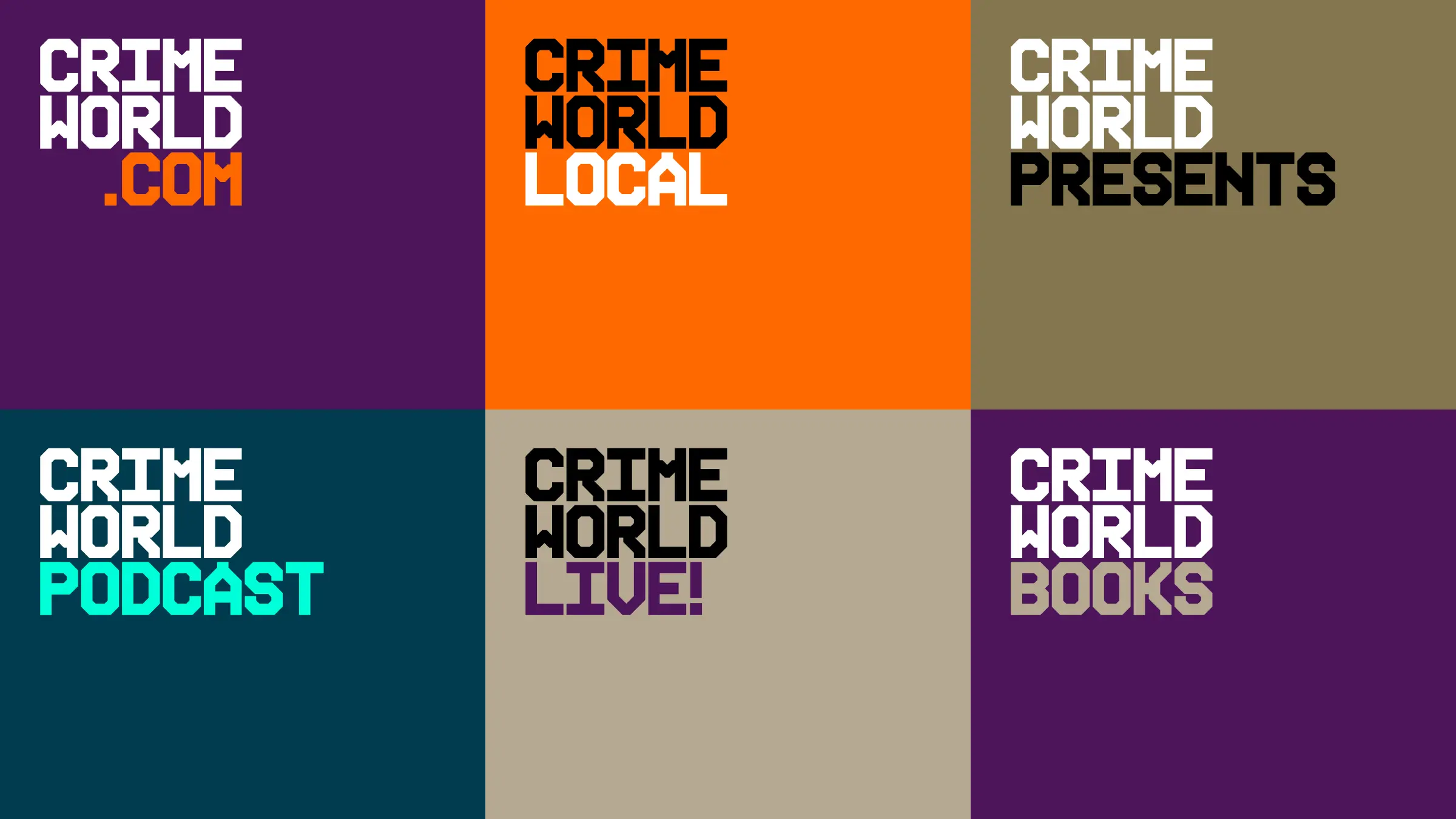
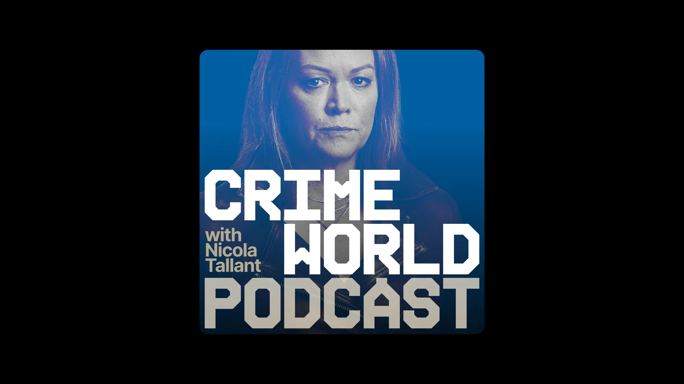
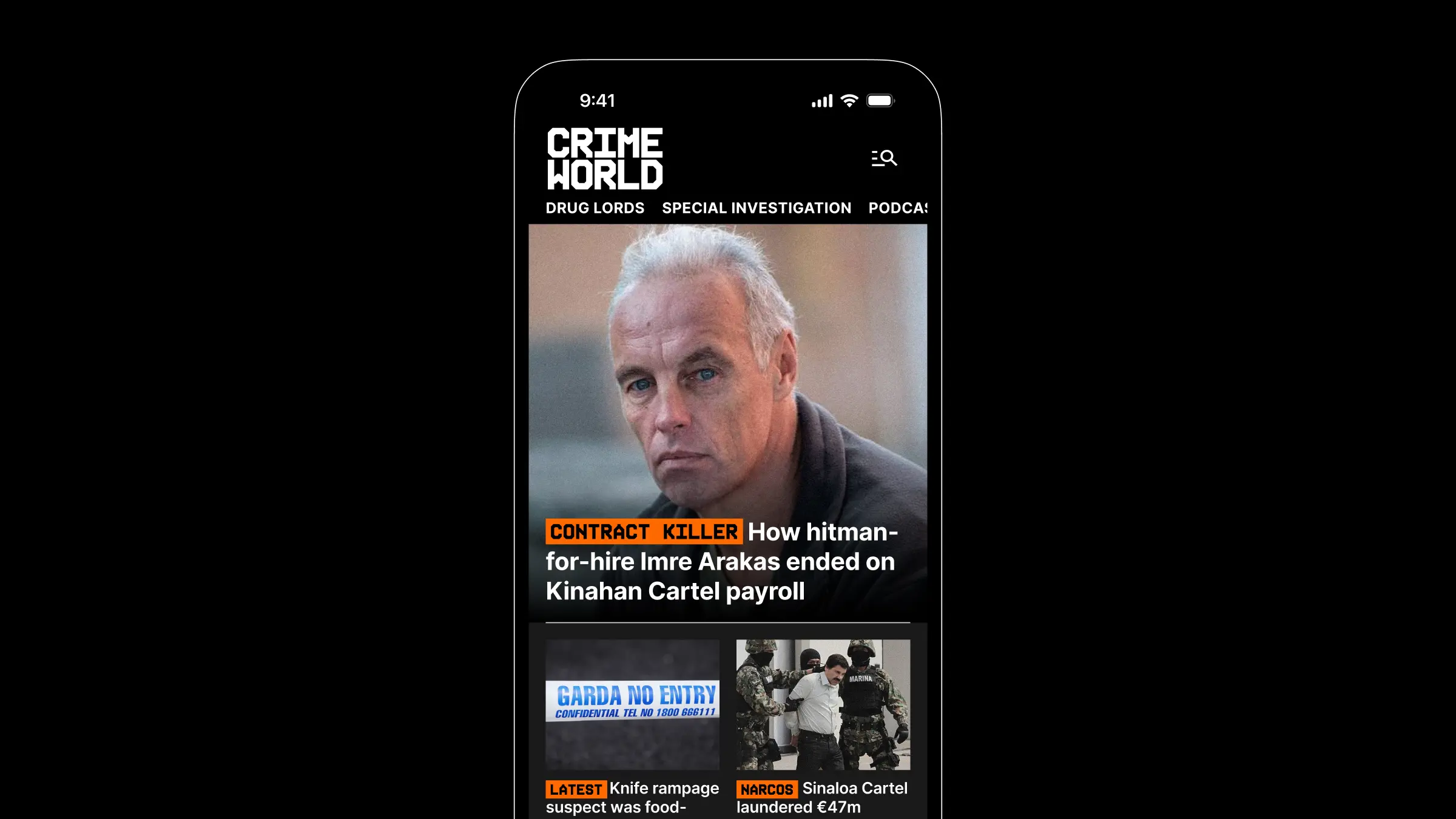
There is a massive appetite for crime content in Ireland, and the tabloid Sunday World has been serving a loyal crime-hungry audience for many years. The Crime World name was originally applied to a spinoff podcast fronted by investigative journalist Nicola Tallant, making the most of her contacts in the world of organised crime. The Crime World brand replaced the existing Sunday World website and united the podcast and SW’s powerful crime coverage under one banner.
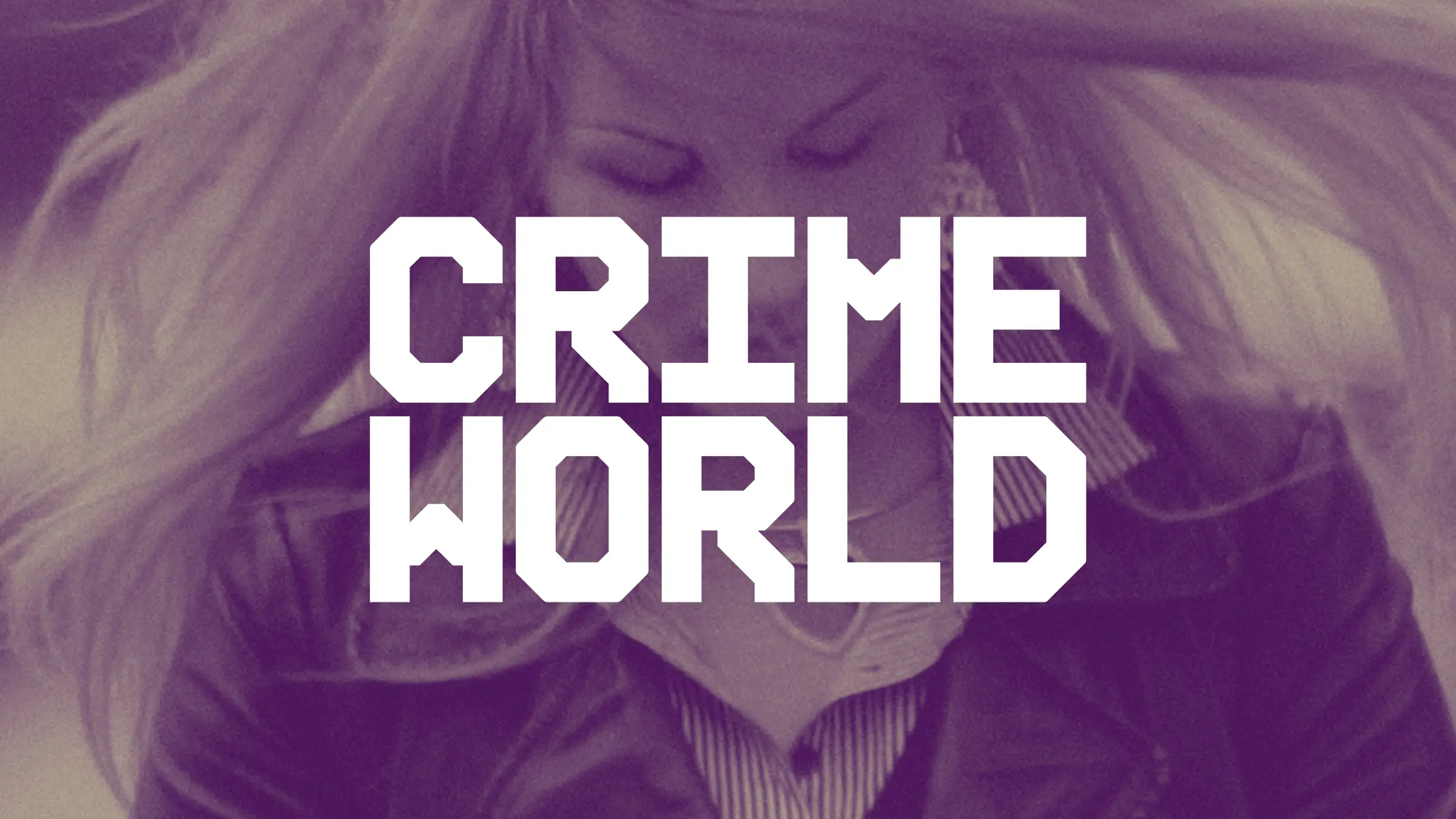
Crime World stands apart from most true crime content, emphasising expert-led news coverage and investigative journalism based on underworld contacts and insider knowledge over the usual family tragedies and victim-centred stories. The standard visual language of crime is a collection of tired tropes: police tape, blood stains, evidence boards, ransom notes and typewriter fonts. Our first priority was to ensure that we avoided the clichés. Crime World is serious, analytical, raw, authentic, and human. Our design reflects these qualities, prioritising impact, drama, and urgency, while remaining clear & accessible.
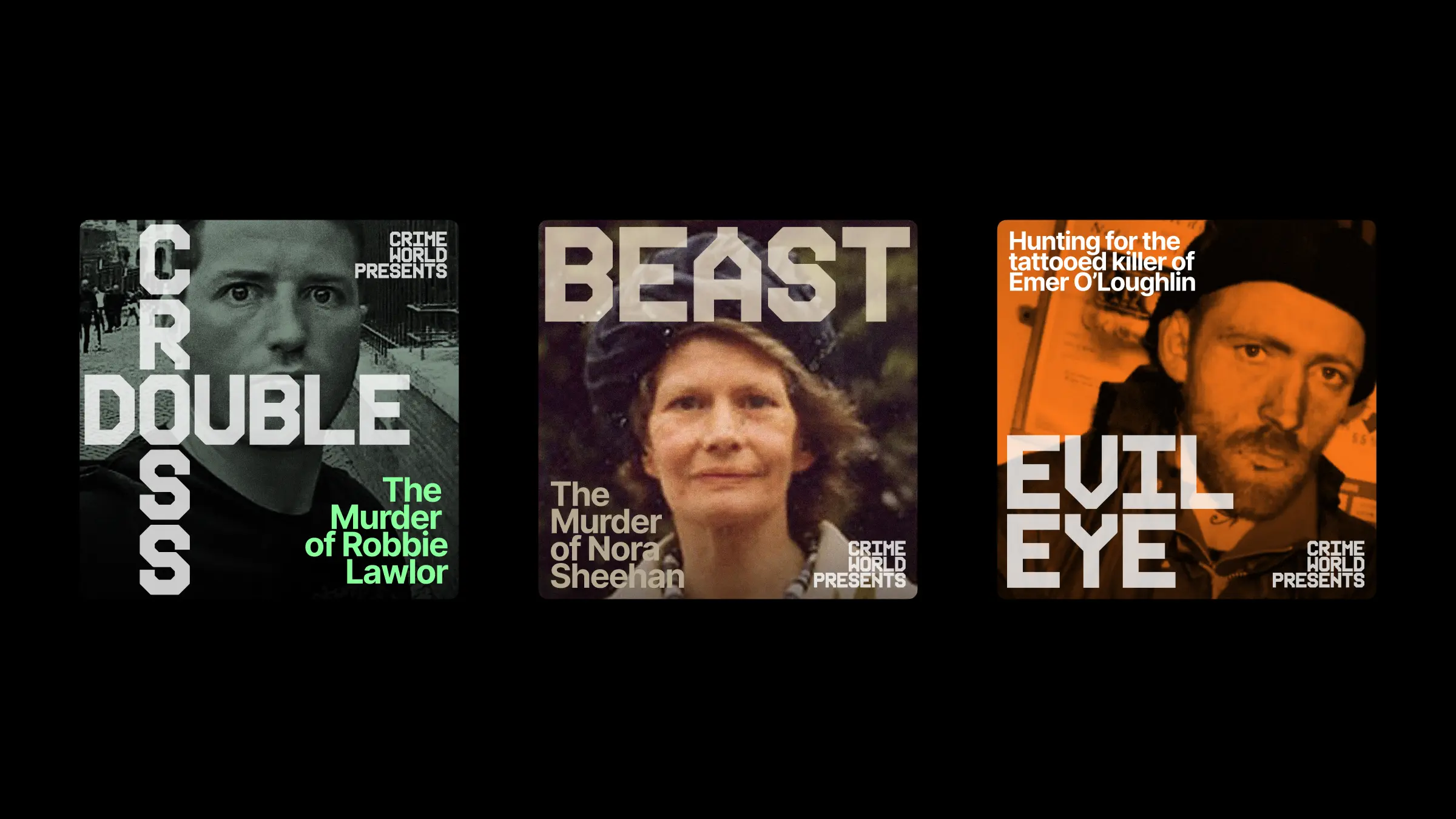
The primary typeface is Interference Bold from Kurrpa Hosk, chosen for its geometrical monospaced character shapes, which evoke the timestamps on CCTV camera footage. Interference’s robust fixed-width letterforms facilitate gridded, tightly-spaced typographic constructions for wordmarks and headlines. The supporting typeface is Inter from Google Fonts, selected for its legibility and open-source licensing. Inter brings a more traditional newsy quality to longer headlines and text.
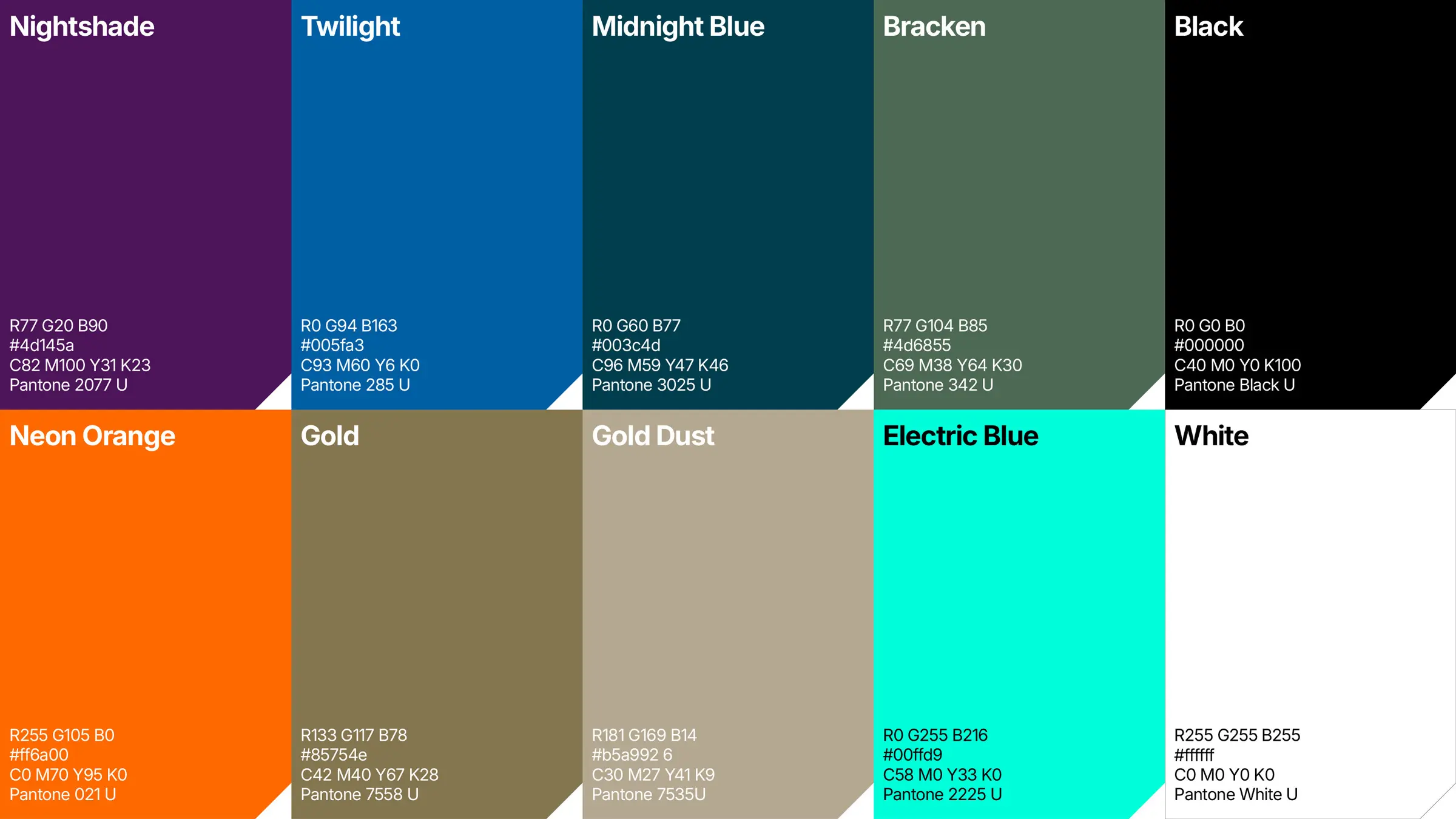
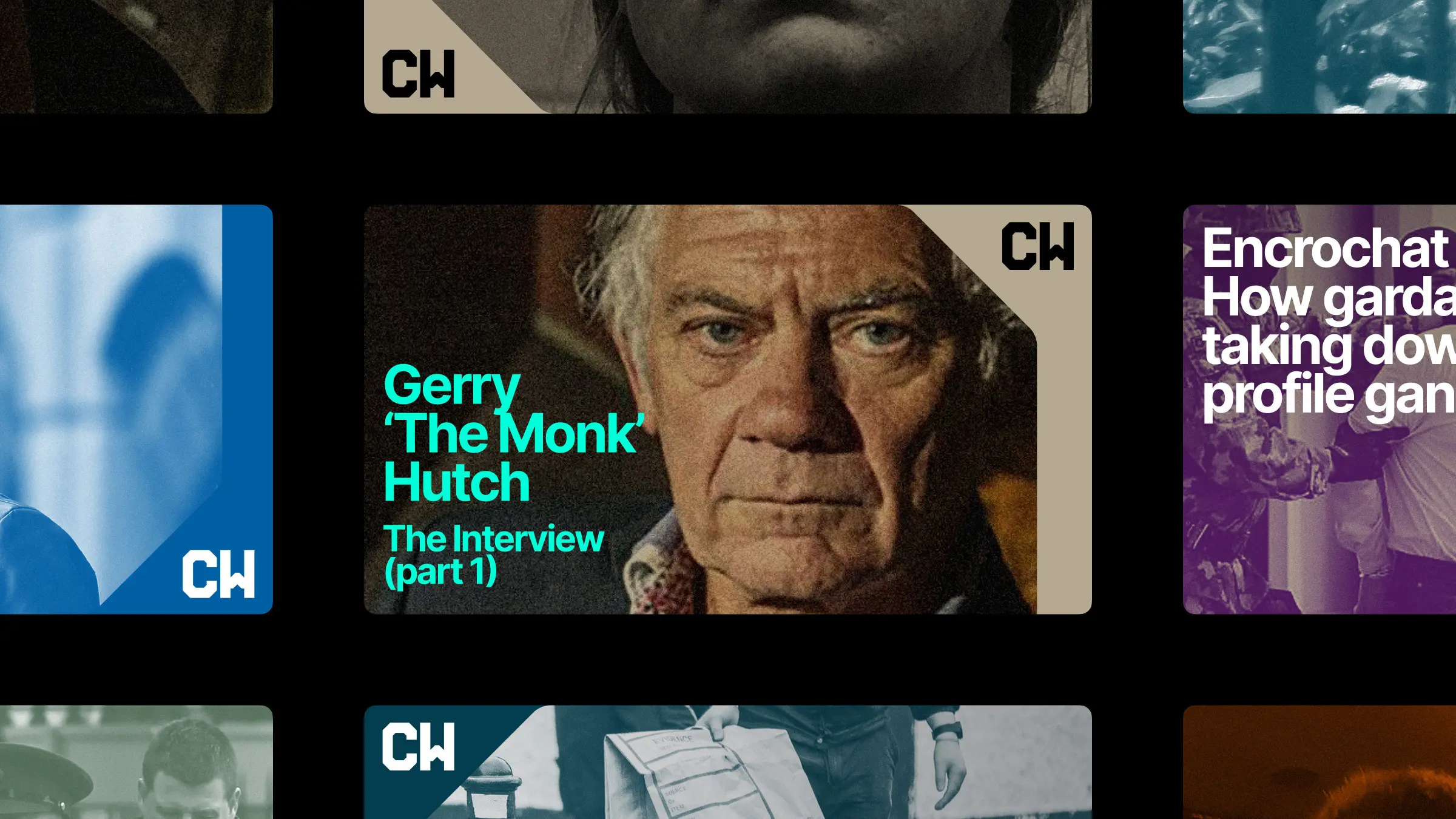
We also wanted to break away from the conventional reds, yellows, and greys of most crime visuals. We found a fresh take in the work of Life magazine photographer and civil rights advocate Gordon Parks, who documented the policing and criminalization of marginalized communities in 1950s America. Parks’ photographs of night scenes and street life lit by neon and fluorescents inspired us to take some late-night walks around Dublin, and the images we collected became the drivers of a colour palette of dark blues and purples, neons and golds.
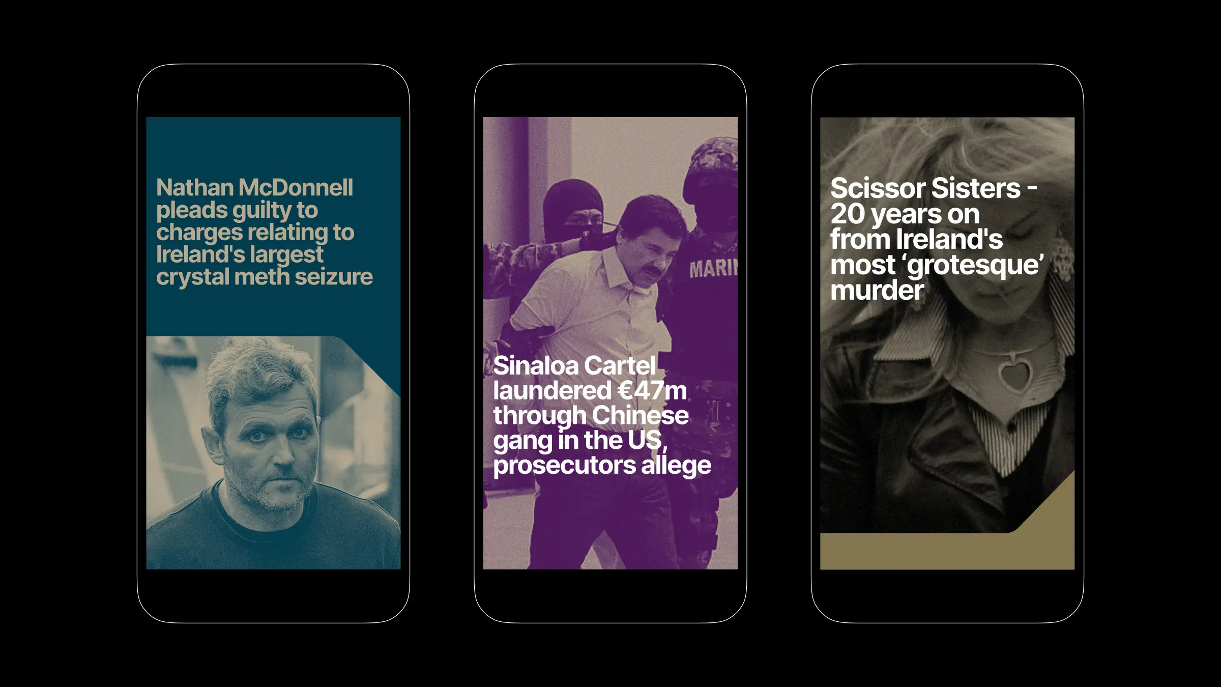
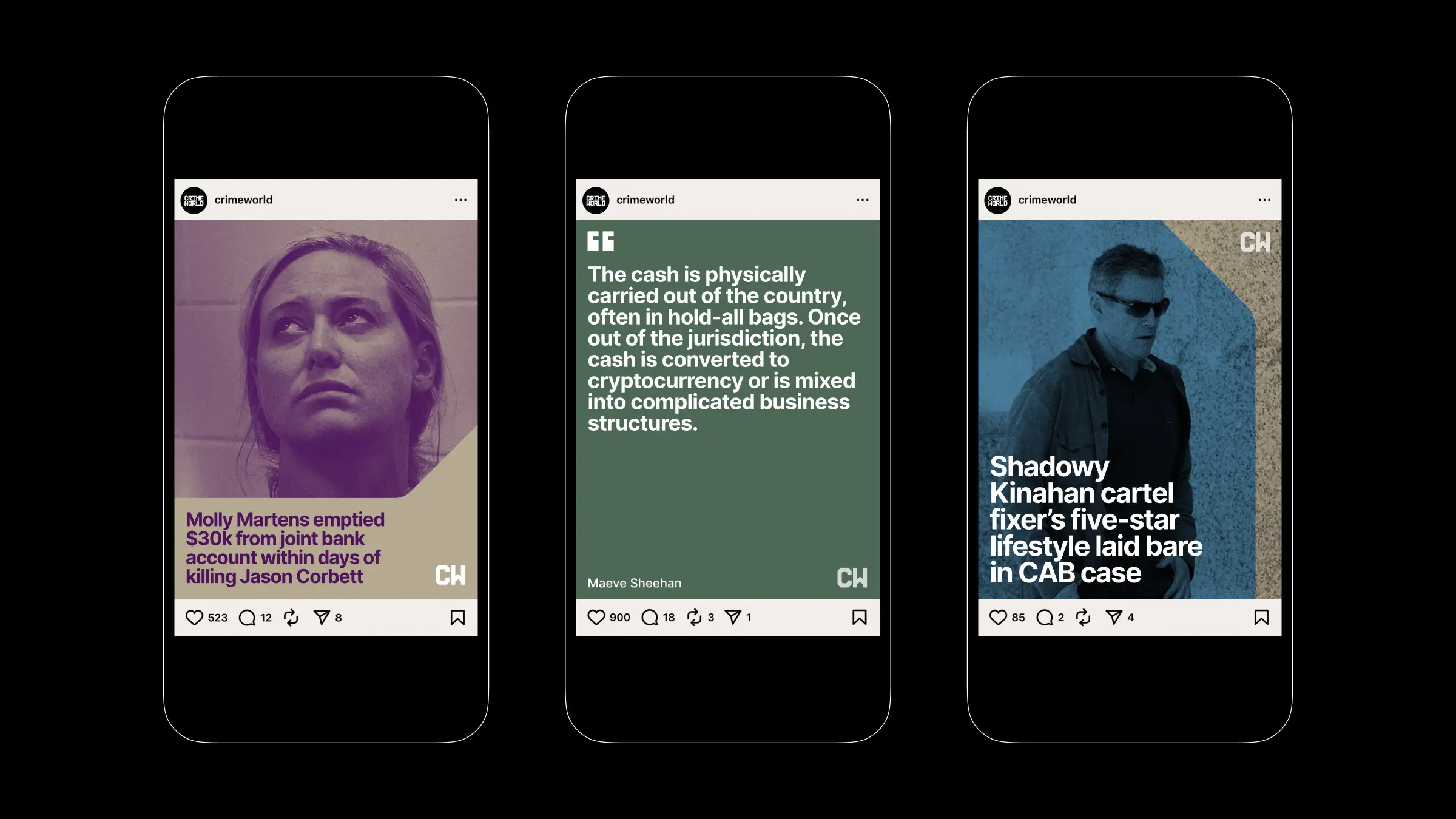
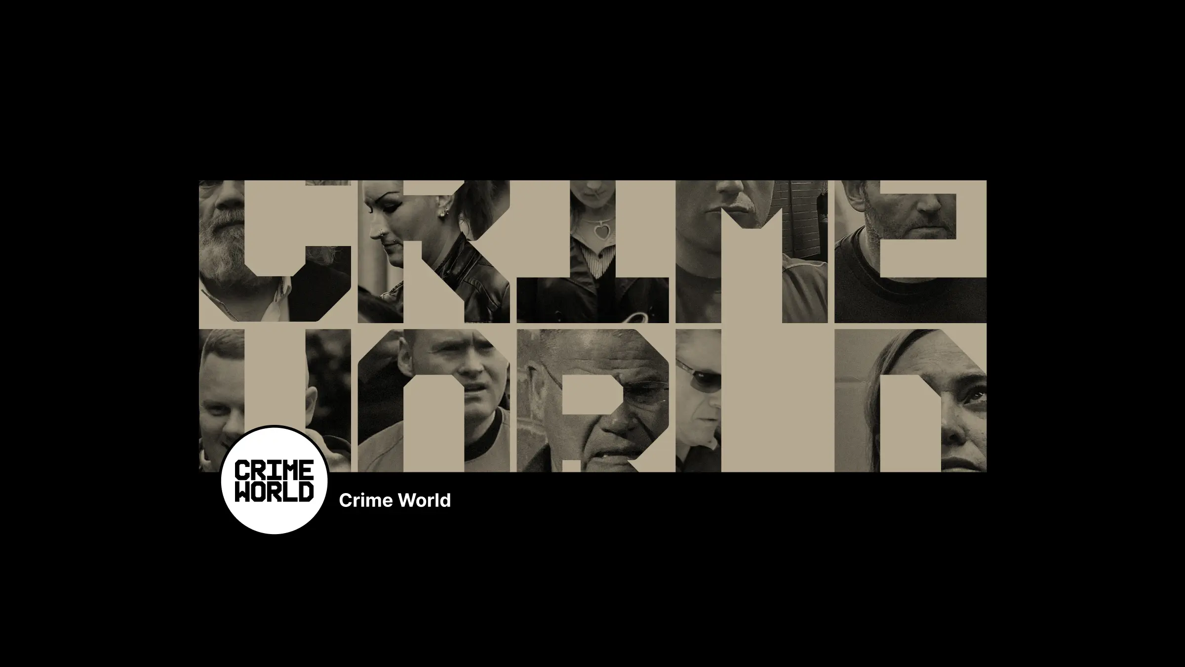
Another component of the design system is a set of graphic shapes based on the 45° angles and subtly rounded corners of the Interference typeface. Cropped sections of the shapes are used as image masks, overlays and layout components.
The nature of the content means that the majority of images will be photos of criminals or their victims, often low resolution and poor quality. But their lo-fi character brings a sense of drama and urgency which can work well for the brand. To enhance these qualities and add interest and distinctiveness to unpromising material, we created a library of monotone and duotone image treatments based on the brand colours. But only perpetrators are treated in this way; to maintain dignity and sensitivity, images of victims are never colour-processed.
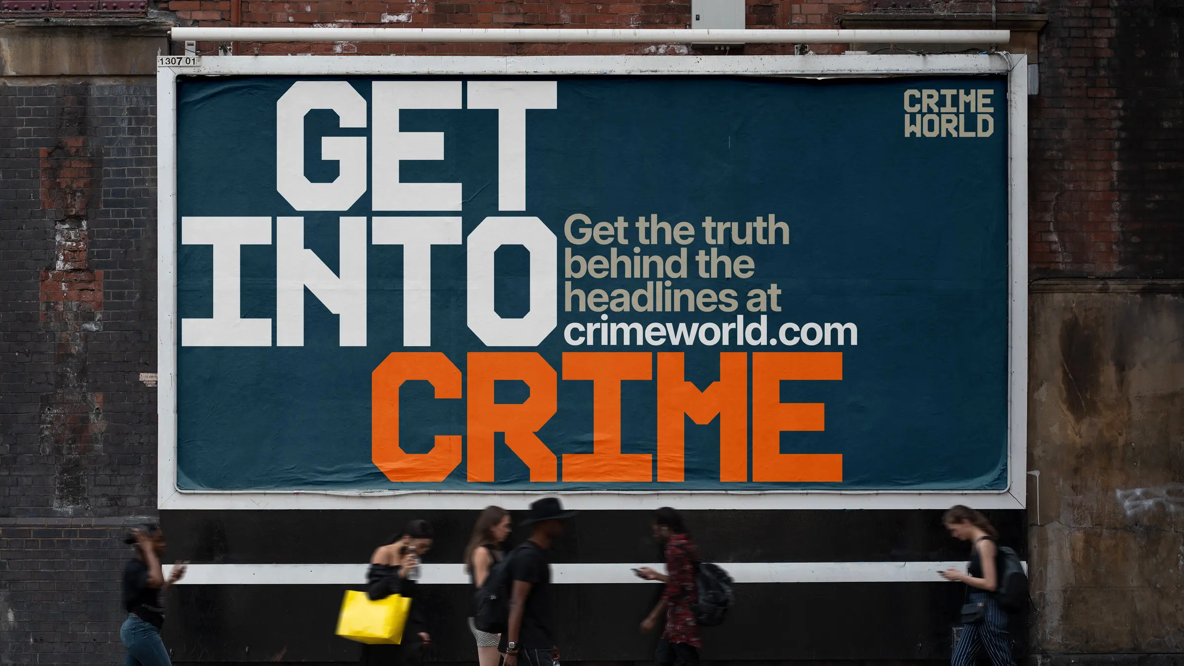
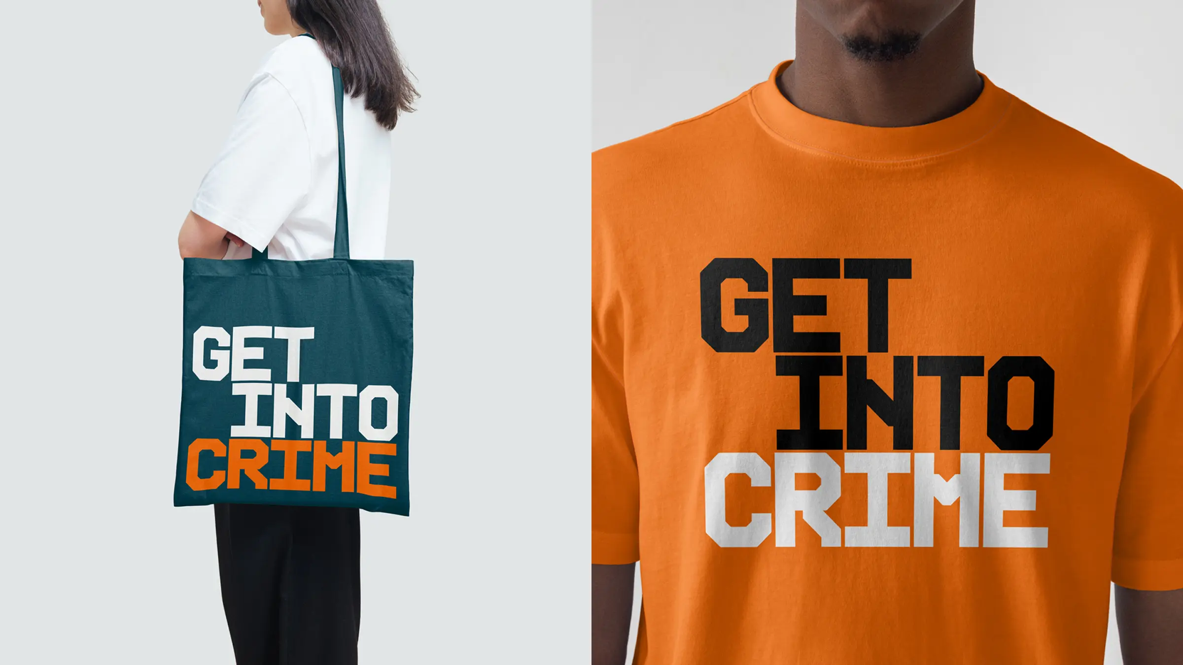
Crime World is primarily a digital brand, and the website, podcasts, video and socials are the core of the operation. But there are well-developed plans for Crime World events, books, and other brand extensions, and we worked with Havas Dublin on applying the visual language to an advertising campaign which will be rolled out across digital, TV and OOH. True Crime content can provide a thrilling exposure to the darker side of humanity without risk. Crime World’s distinctive, sharp and contemporary design system ensures that it need not be a guilty pleasure.
MPA team: Mark Porter, Alan Keer, Clare Bell.
Strategy: Leslie Mello.
Motion: Smörgåsbord Studio and John Beckers.
Campaign: Havas Dublin.
Client team: Lee Martin, Clíona O”Reilly.