Irish Independent Masterbrand
A new visual langauge
to unite Ireland’s most
iconic media brands
The Irish Independent (known locally as the “Indo”) is evolving from a disparate group of newspapers, websites and apps into a single multi-platform news brand. We were asked to deliver a design system which would unite existing properties and audiences while attracting a new younger demographic to the digital offering.
Our discovery process gave us five key drivers for the new brand: distinctive, human, modern, Irish and inclusive. One of the key challenges was to work with traditional and over-used signifiers of "Irishness" such as the harp symbol and the colour green, but to reinvent them for a contemporary audience. As a UK-based studio we knew that this project would call for some true Irish expertise, so we strengthened our team by bringing in Dublin-based designers Clare Bell and Max Phillips to ensure that the new identity would resonate with a local audience.
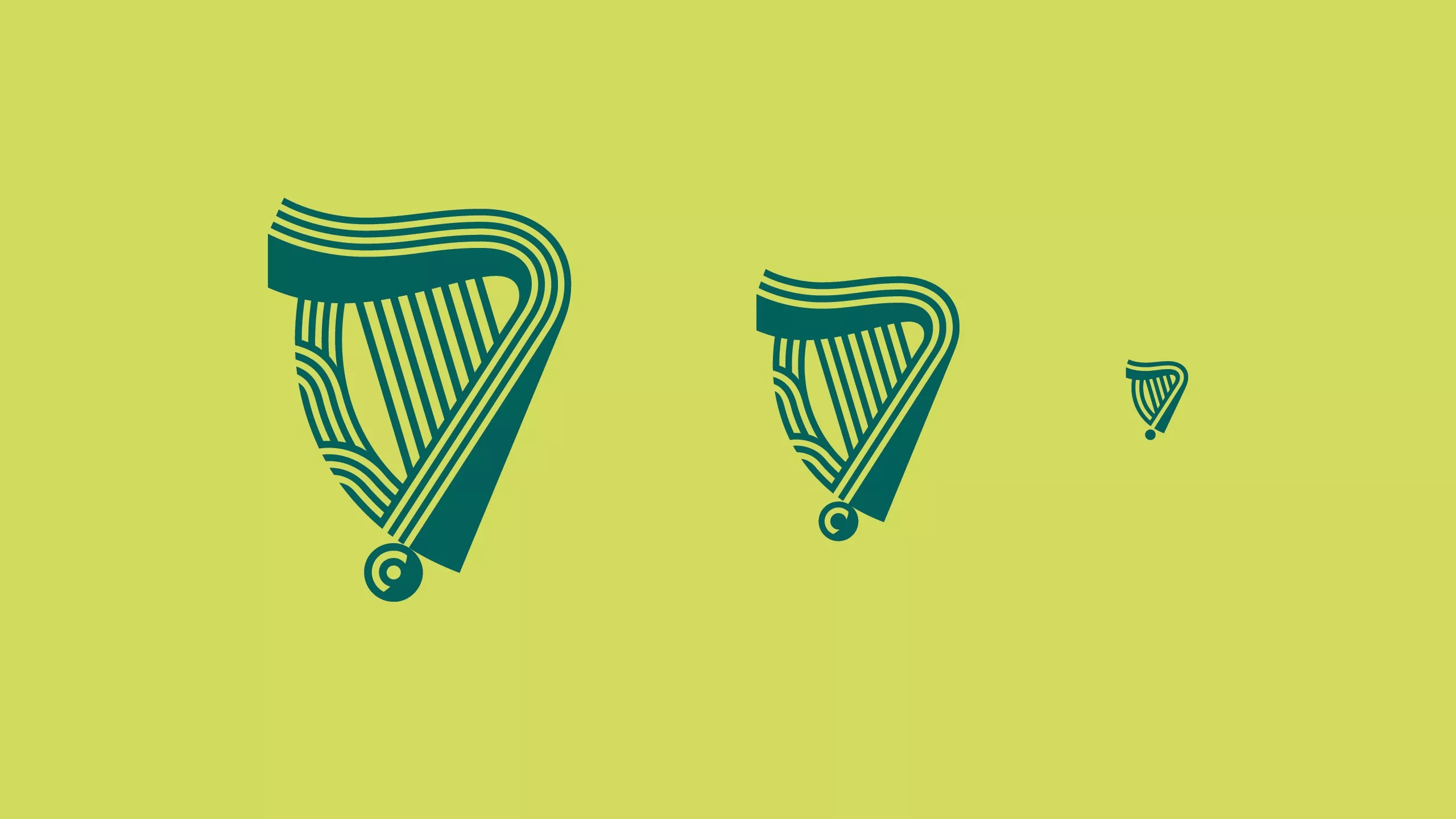
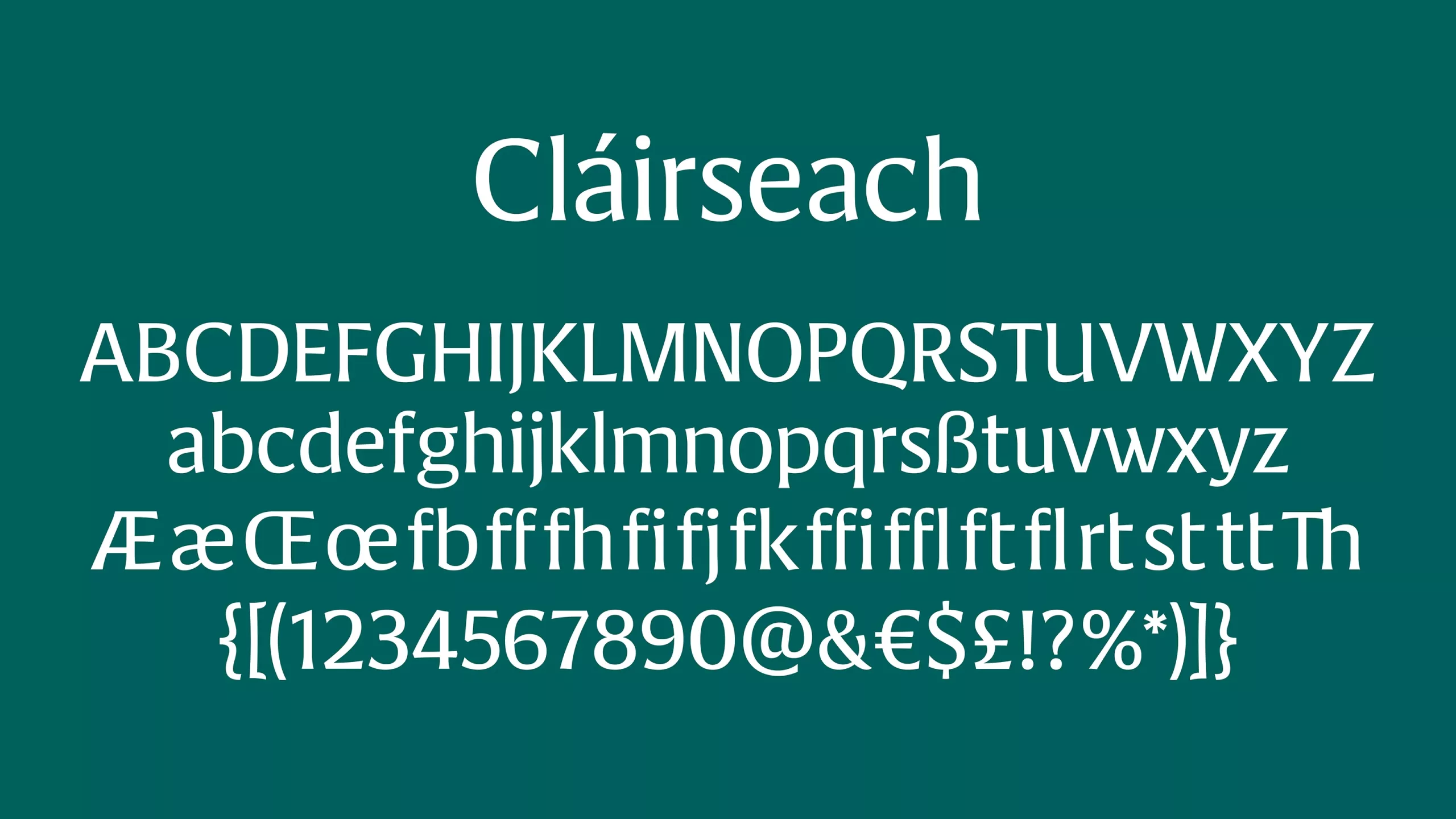
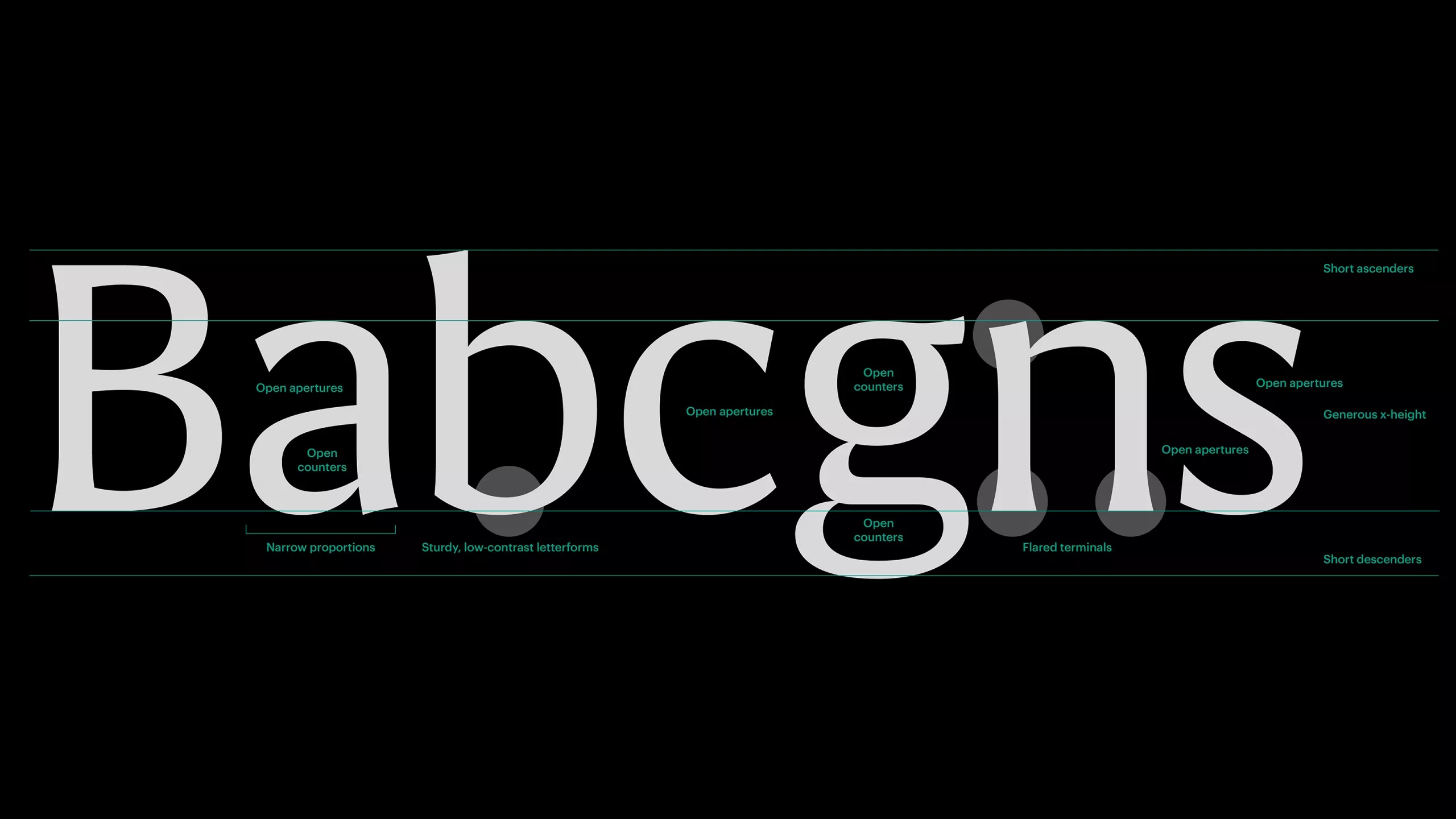
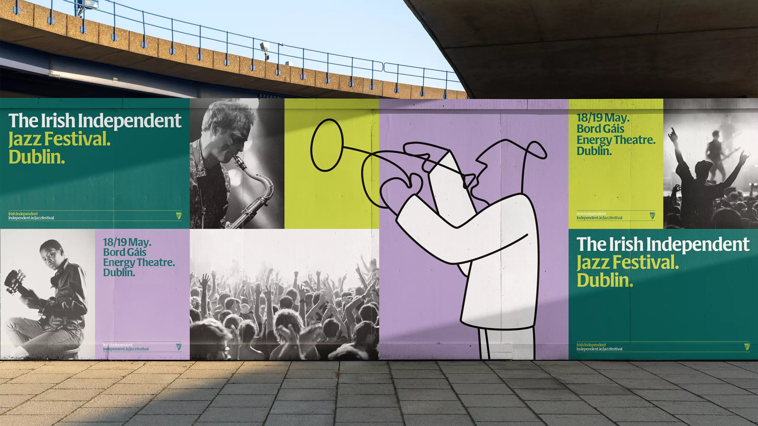
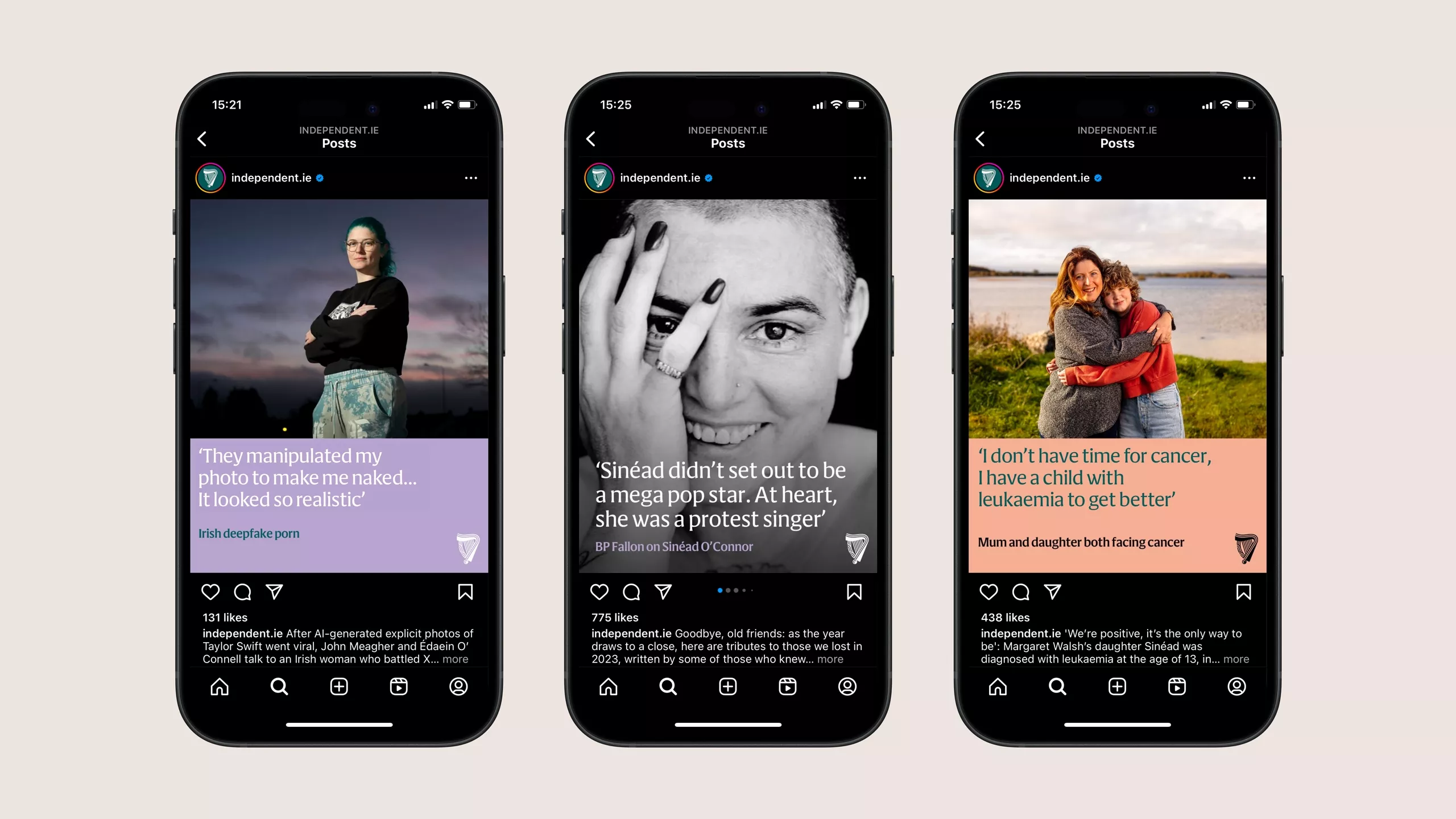
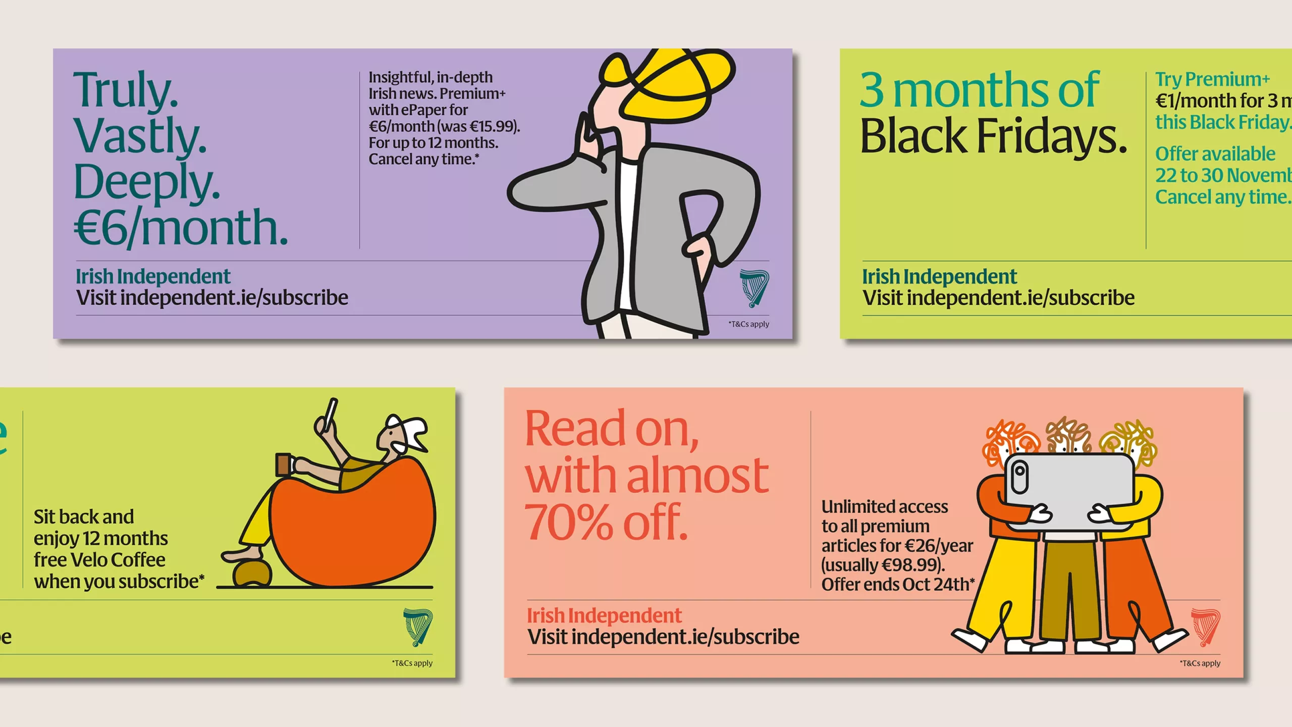
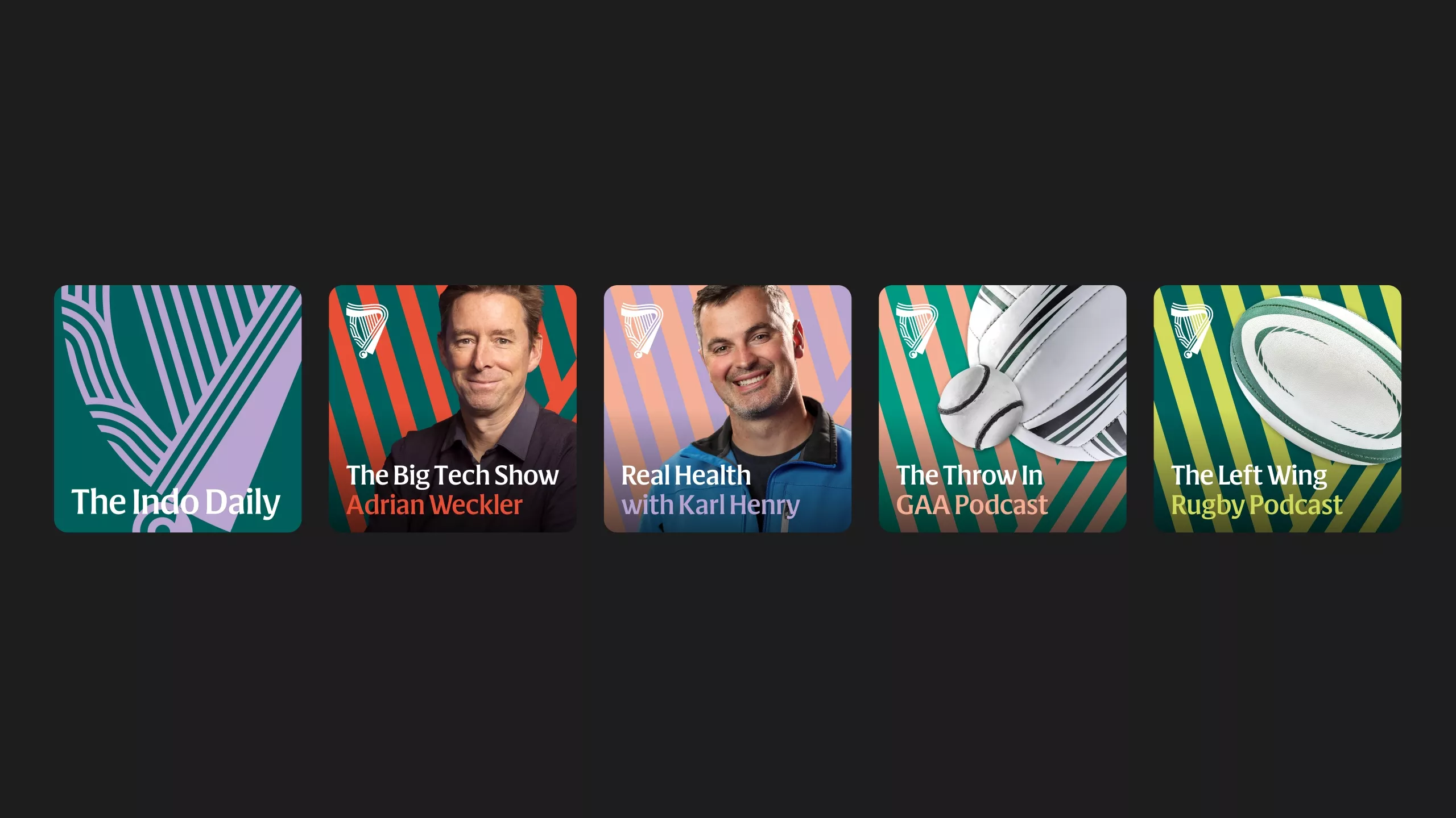
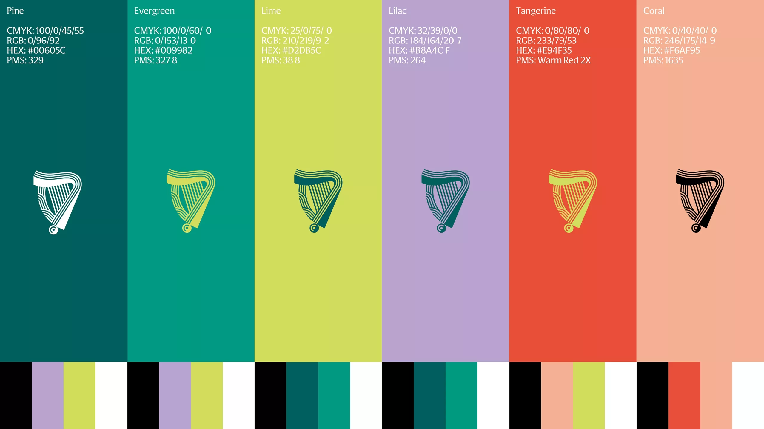
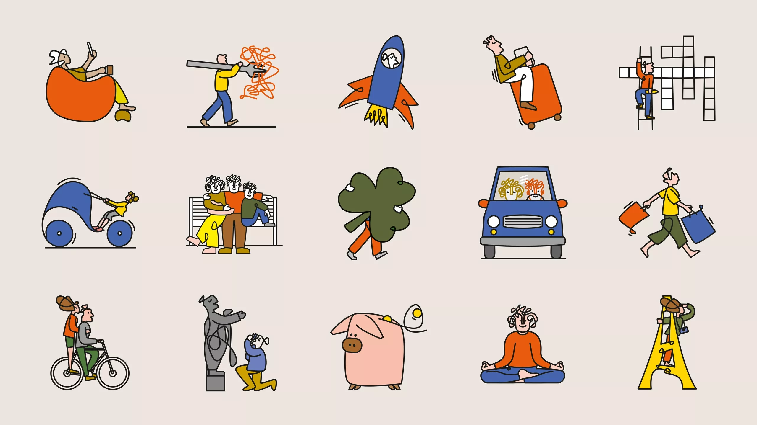
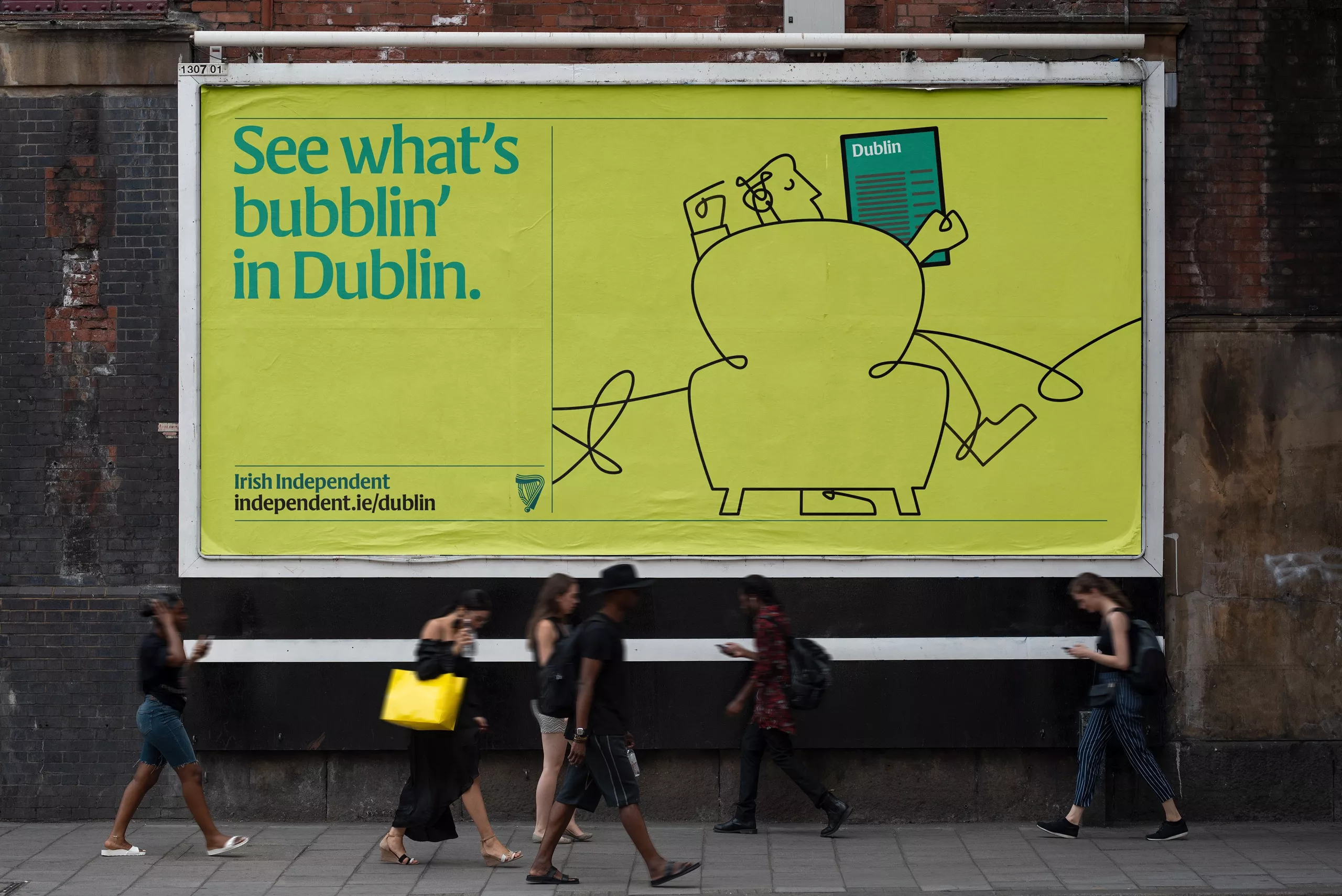
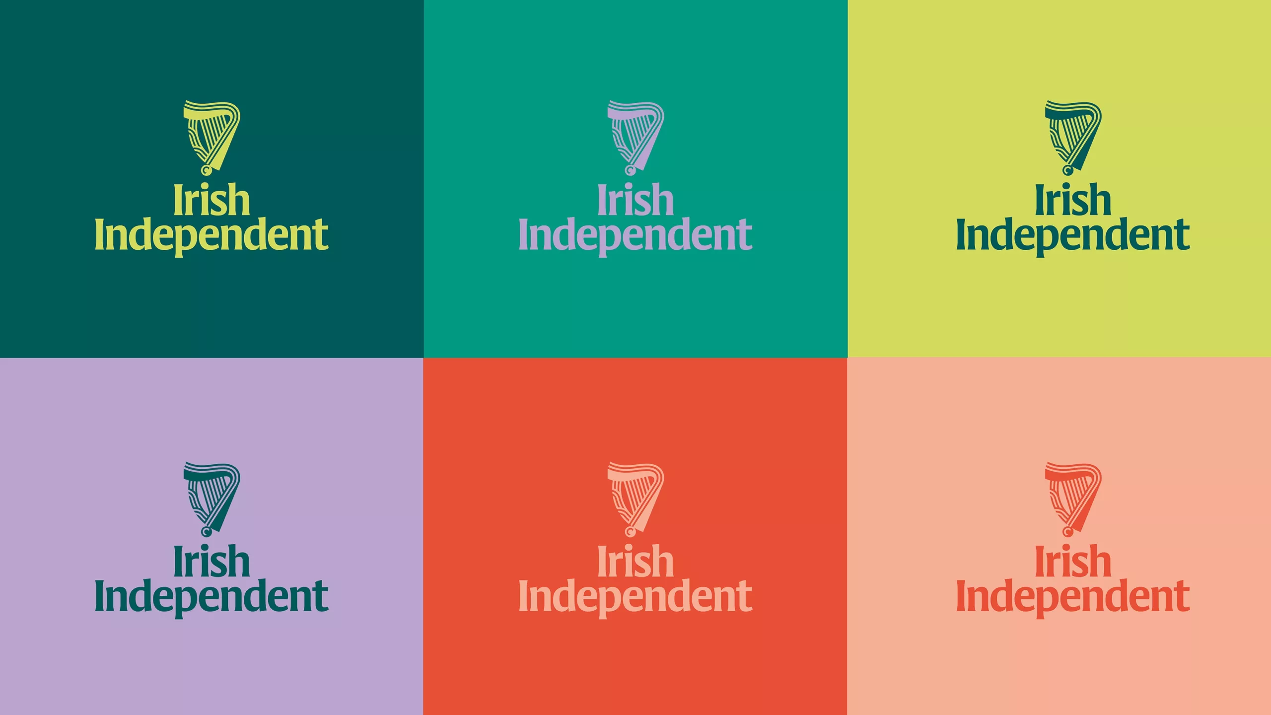
We developed a bold new wordmark, which was expanded by Signal Type Foundry into a bespoke branding typeface designed to work harmoniously with the existing editorial type palette: Cláirseach (Irish for harp) is a four-weight flare-serif inspired by the distinctive wedge-shaped serifs of insular calligraphy. The harp emblem, which the Indo has used since 1961, was redrawn to make it both more modern and more ownable. The frame and the strings are now constructed from parallel stripes, a key formal element in Irish decorative arts since the Neolithic Era. The stripes unravel into a distinctive monoline illustration style and we commissioned illustrator Andy Goodman to create a library of over 40 characters and scenarios for use across all the Indo's communciations. The new colour system introduced a fresh, contemporary suite of greens, combined with lavender, coral and tangerine, all based on the vibrant pigments of the inks used in the Irish manuscript tradition. But while many components celebrate the Indo's proud Irish heritage, the overall aesthetic is sharp, modern and thoroughly at home in the digital age.
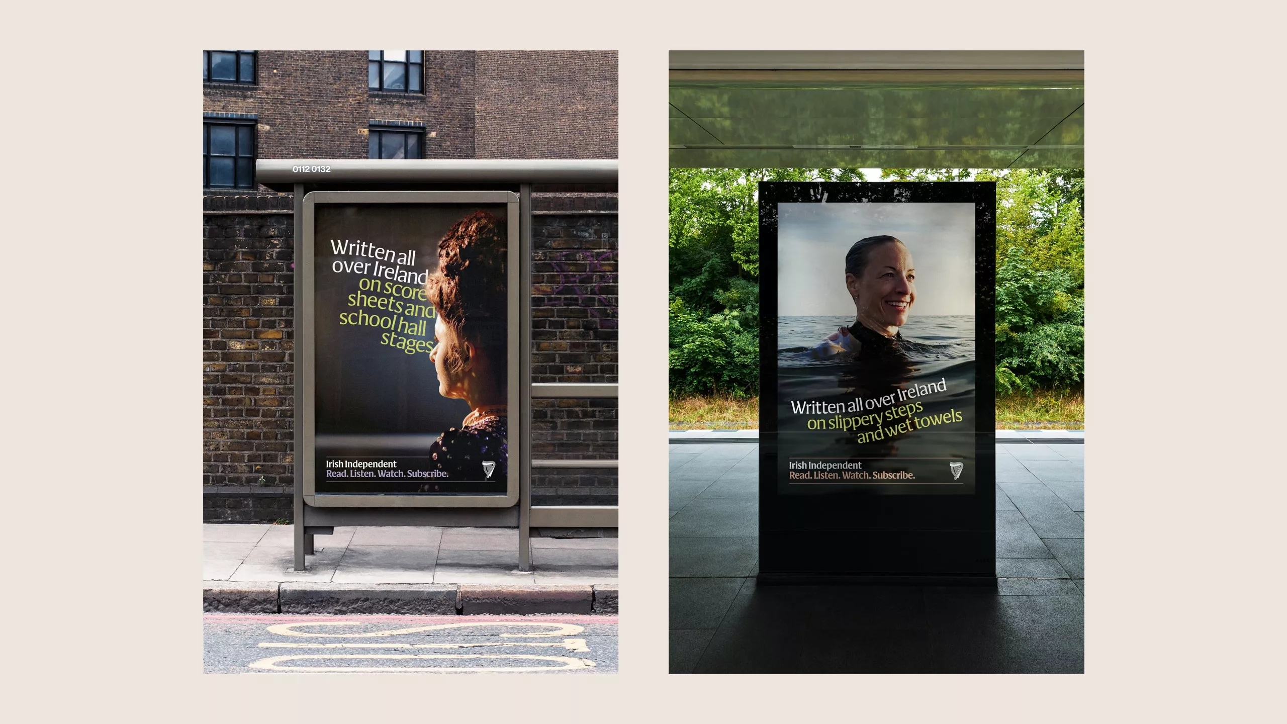
Editorial product design was out of scope, but we delivered a comprehensive set of assets for marketing and promotions, social media, and motion graphics, and refreshed print and digital branding in line with the new system. The result is a flexible graphic language which unifies and energises the Irish Independent’s communications across all channels and touchpoints.
In the first quarter after launch, brand tracking saw awareness outmatching the Indo's primary competitor RTÉ (The Irish state TV network) for the very first time.
Dublin design team: Clare Bell & Max Phillips
Custom typeface: Signal Type Foundry
Motion design and animation: Smörgåsbord Studio with John Beckers
Music and sound design: Smörgåsbord Studio with Wevie
Illustrations: Andy Goodman
Copywriting: Jim K Davies
Strategy: Leslie Mello
OOH & TV Campaign: The Public House