V&A Museum
A future-proof
identity system for
one of the world's
leading museums
The V&A family is growing. London’s iconic museum of art, design, and performance is opening several major new venues, and broadening its wide range of brand activities. After a rigorous selection process, the V&A chose MPA to deliver a new visual identity system to support this ambitious expansion.
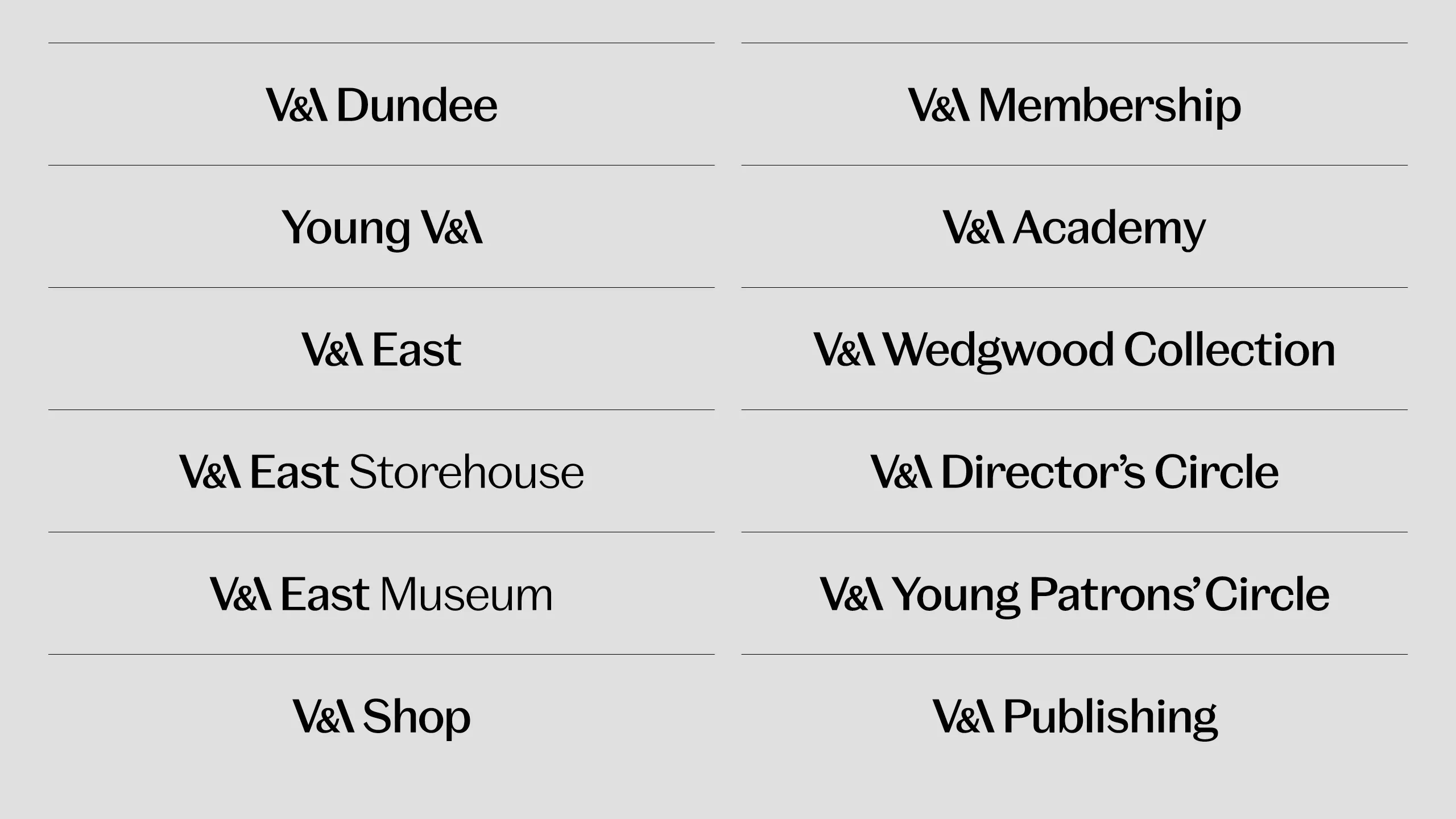
The primary aim was to make a complex brand architecture explicit and intelligible to the audience, clarifying the relationship between individual venues and the Masterbrand. But different sites and programmes also needed scope to develop and project their own distinct identities within the framework.
We began with an extensive discovery process, conducting interviews and workshops with all major stakeholders and venues. Strategy and key principles were agreed before work began on a detailed design solution.
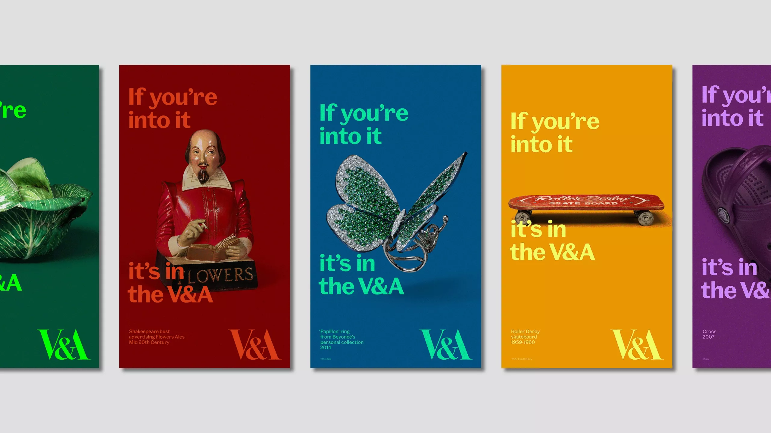
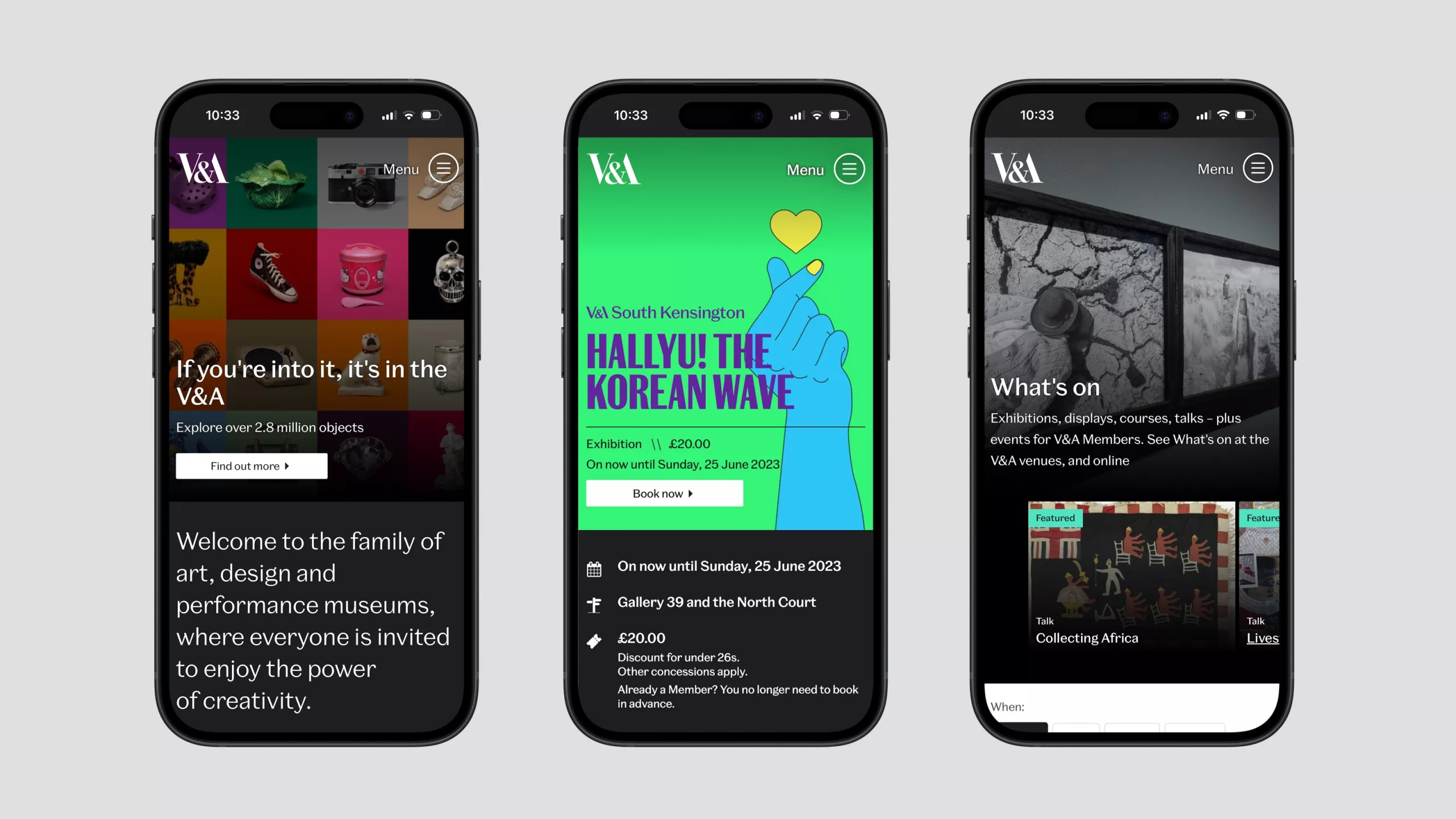
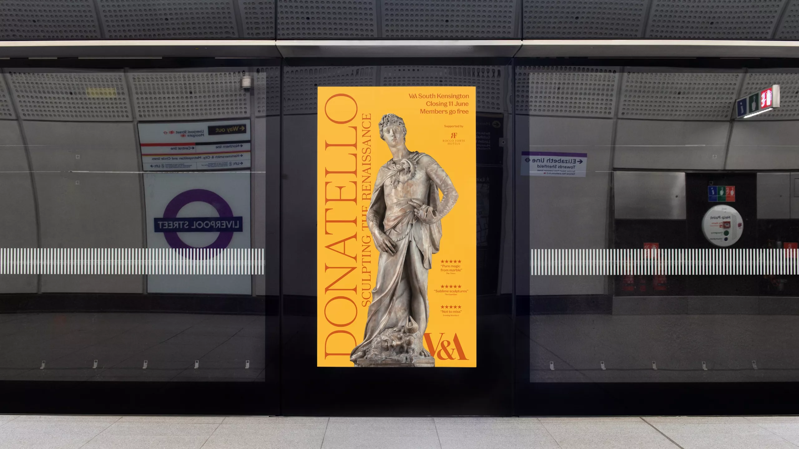
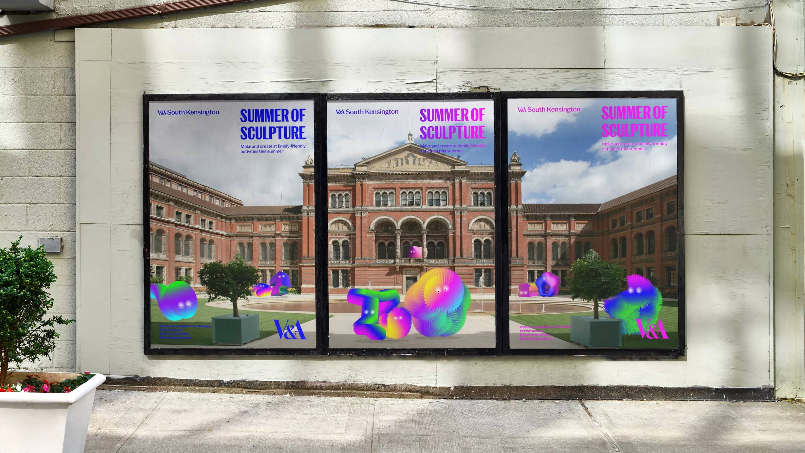
We established a strict information hierarchy for communications across all platforms, with clear guidelines for visual relationships between content, branding and orientation. A set of simple and logical rules define the scale and position of the iconic V&A monogram and the new local wordmarks, along with content promotion and access information. To facilitate this, we designed a modular grid system which is flexible enough to adapt to any format from vertical banners, through billboards, social posts and video to digital advertising.
We took a light-touch approach to colour and pattern. Both are valuable tools for venues to project their distinctive characters, so we established some broad parameters leaving plenty of space for individual experimentation and expression. We also brought the design system to life in a set of motion graphics principles and templates.
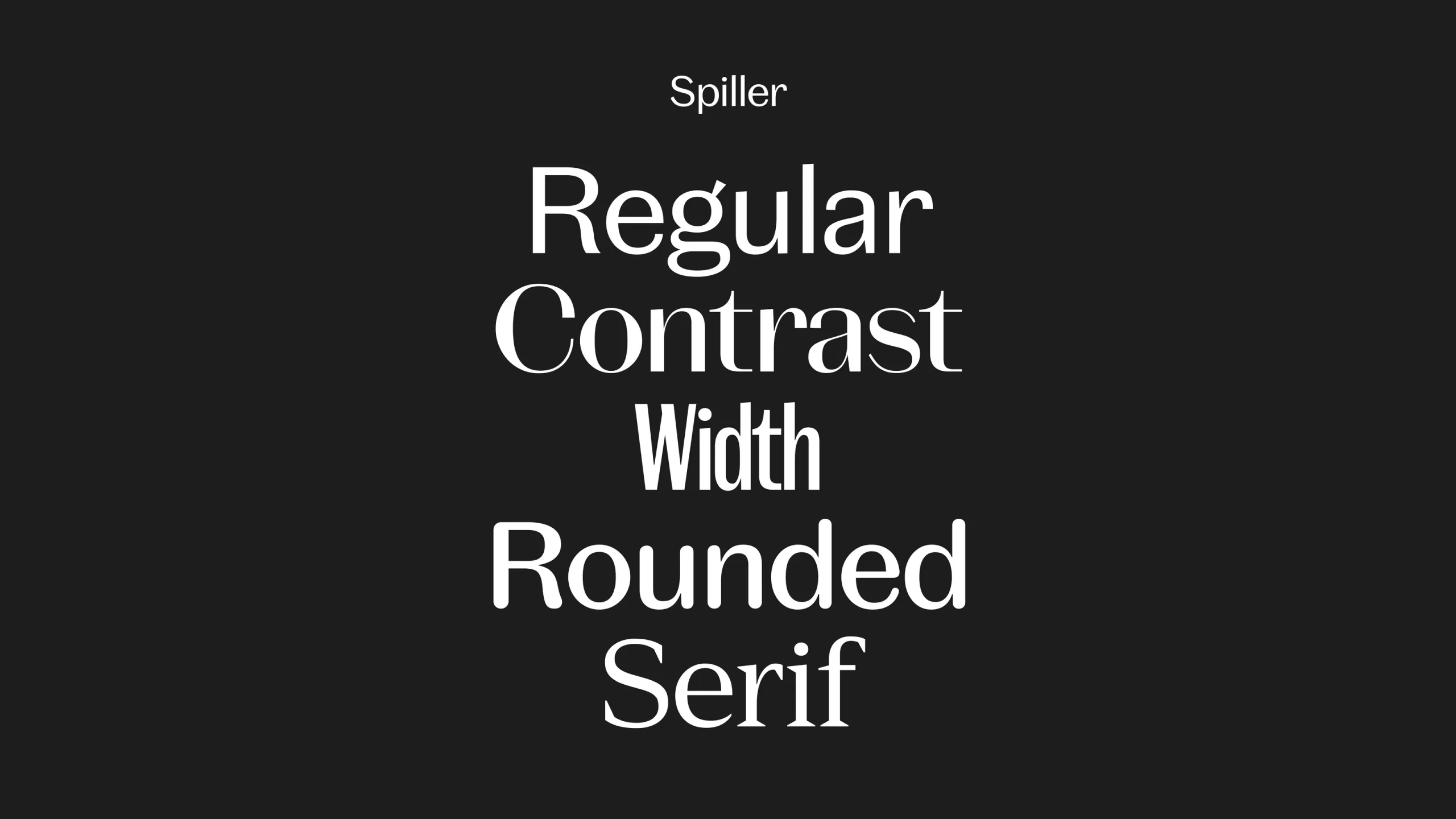
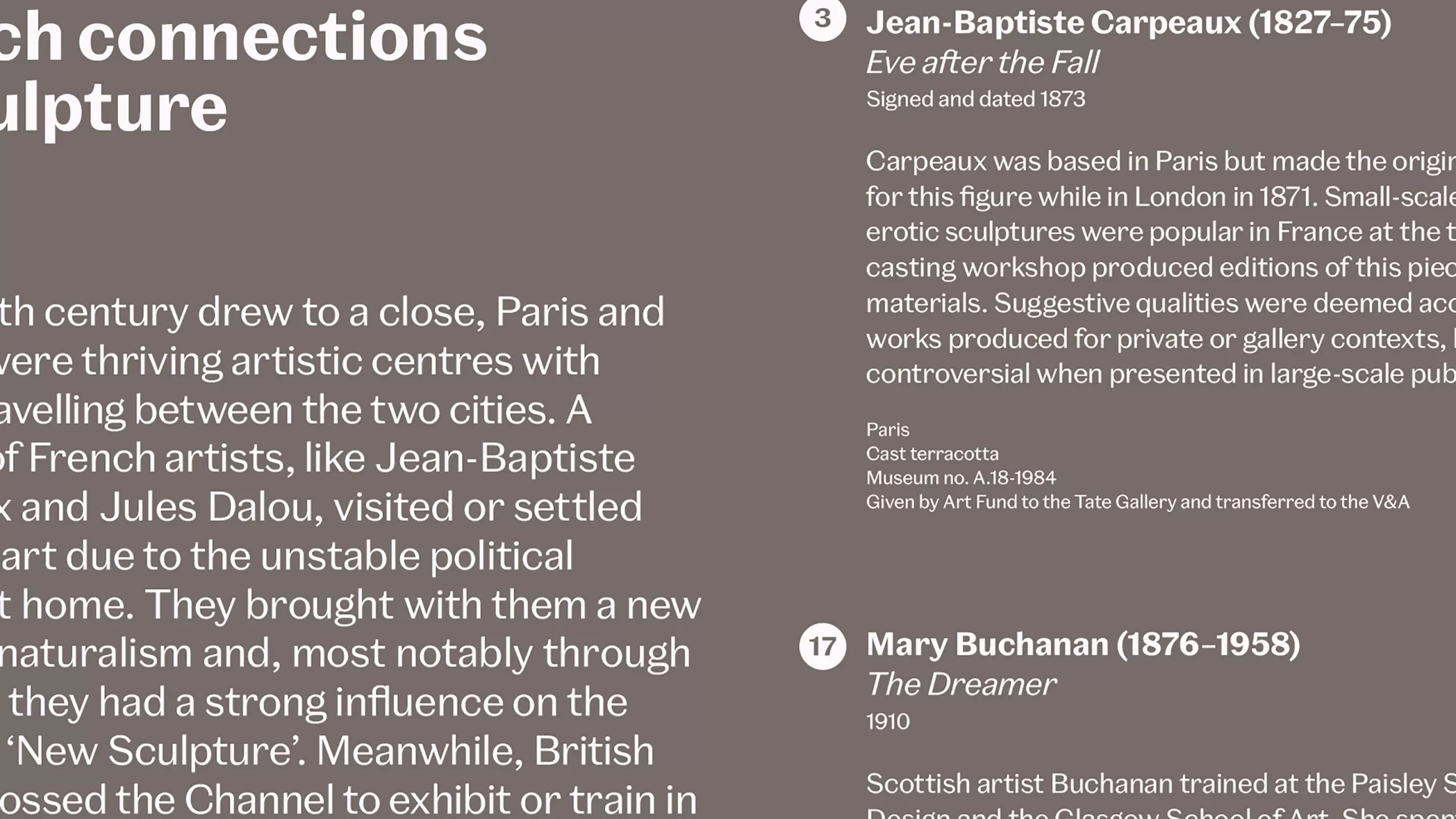
The cornerstone of the new design system is a bespoke typeface created for the V&A by Commercial Type. The new face, (named Spiller after Ethel Spiller, one of the V&A’s first advocates of public outreach), is functional enough for interpretation labels, signage and forms, but sophisticated enough for large-scale display. It uses variable font technology to embrace a wide range of voices, from elegant and refined to bold and dramatic, allowing curators and venues to project diversity and variety while maintaining recognition.
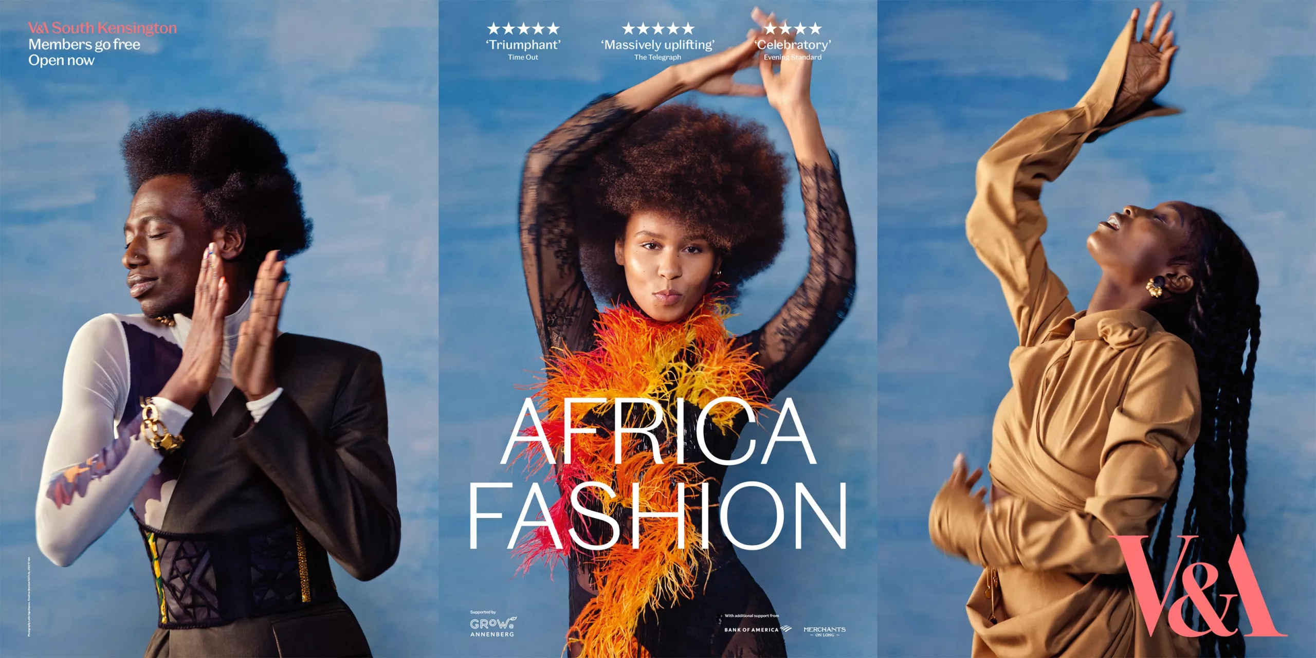
In line with the original brief, our system has provided the framework for a number of new venue identities and campaigns created by other distinguished agencies including Pentagram and adam&eveDDB.
The new V&A visual identity system was two years in the making. We are proud to have delivered a project which answers the complex requirements of the brief in a rational, relevant and responsible way, and enhances the experience of V&A visitors, partners and staff.
Custom typeface: Commerical Type
Motion and behaviour: Smörgåsbord Studio with John Beckers
V&A Head of Design: Evonne Mackenzie
V&A Head of Marketing: Sophie Rouse
V&A Project Owner: Sophie Brendel
V&A Brand Campaign: adam&eveDDB
V&A South Kensington Identity: Pentagram