Knack
Re-inventing Belgium’s
premier weekly magazine
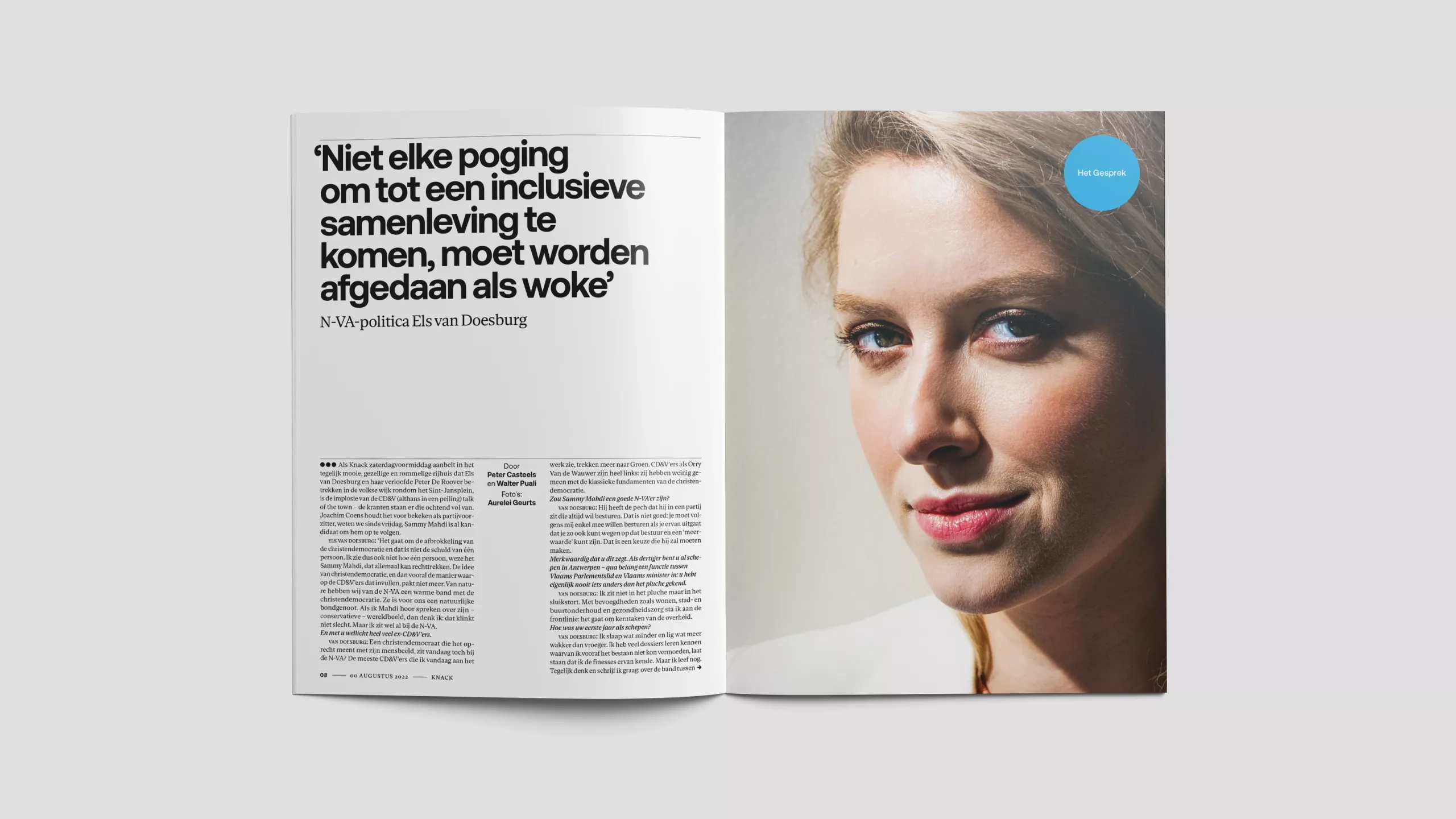
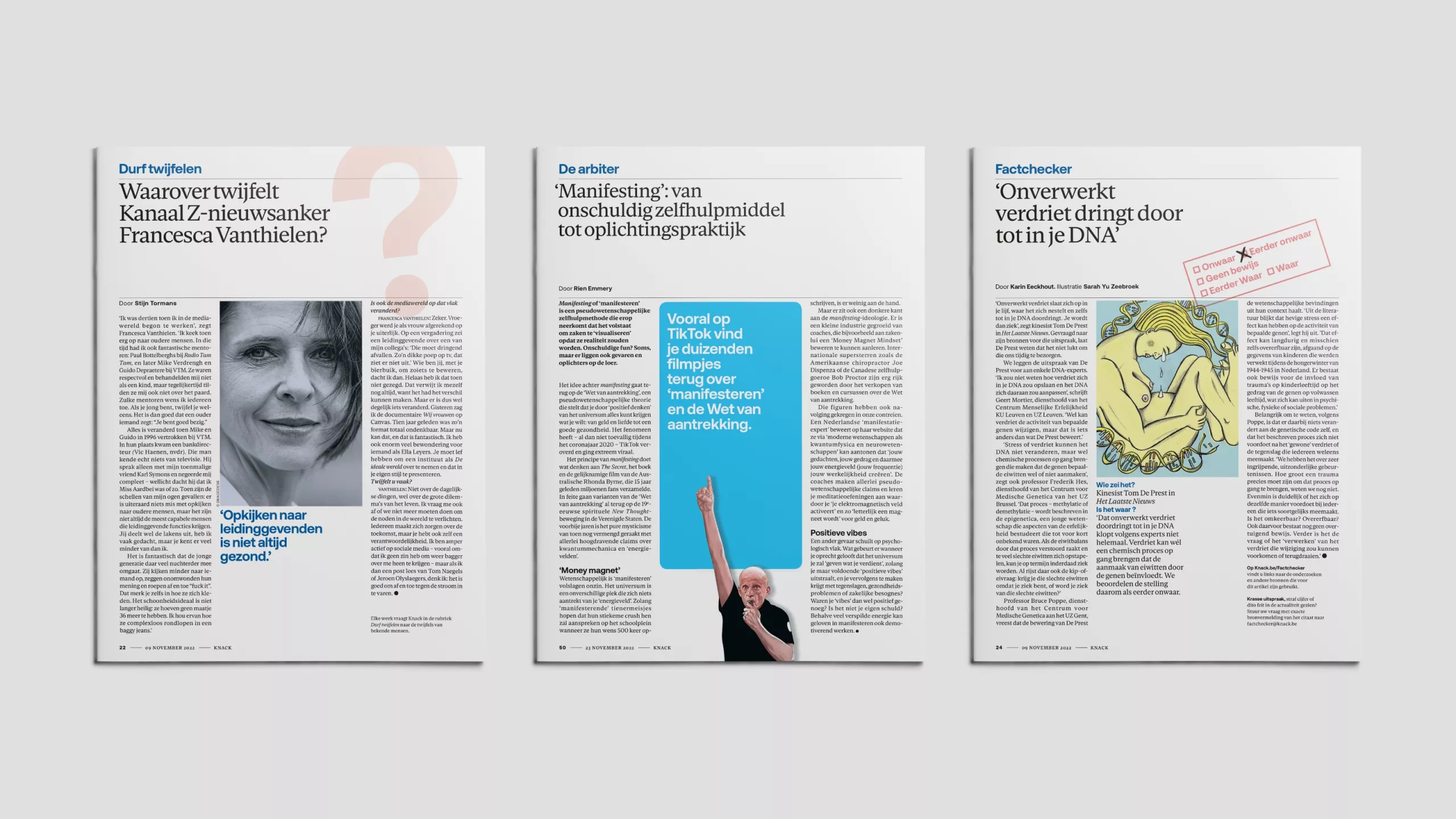
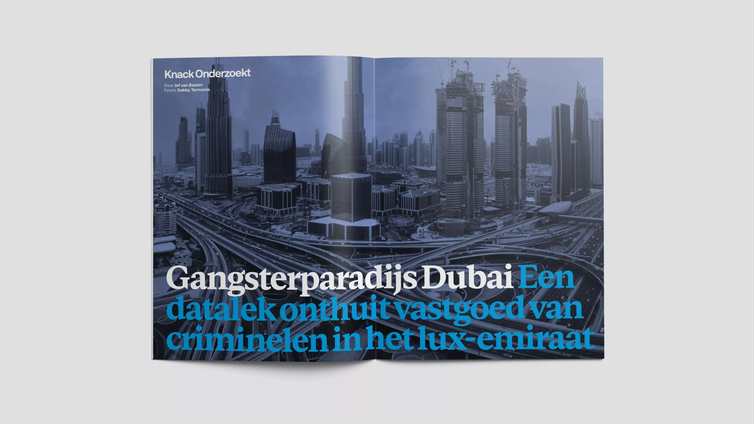
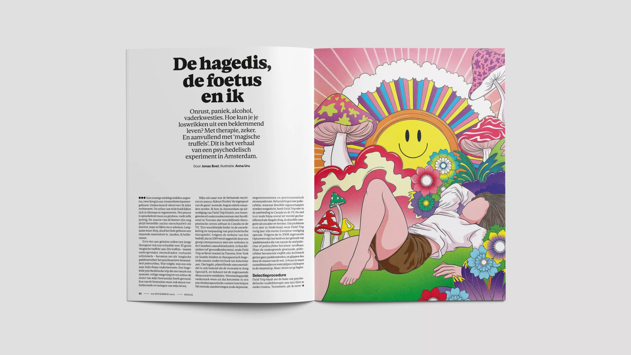
Under its tagline “Durf twijfelen (Dare to doubt)”, Knack takes a critical and inquiring view of events and society in Belgium and the world. As Flanders’ best-loved weekly magazine it has a distinguished history and a loyal core audience. But it was losing prominence in its market as the habits of its readers changed. We were asked to modernise the title and restore its authority, while also making it more inviting and accessible.
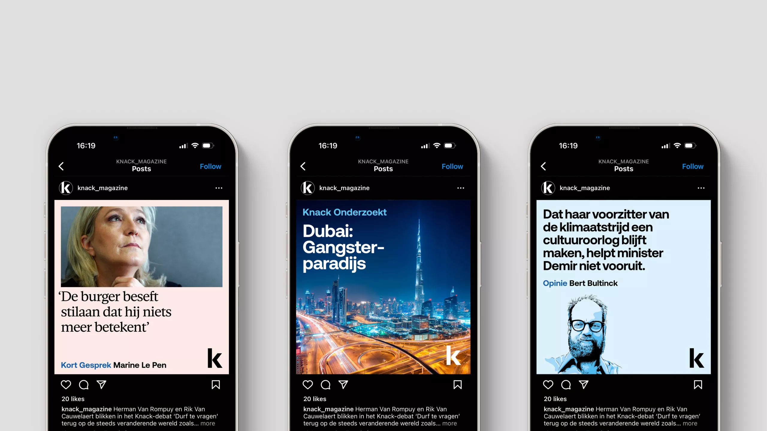
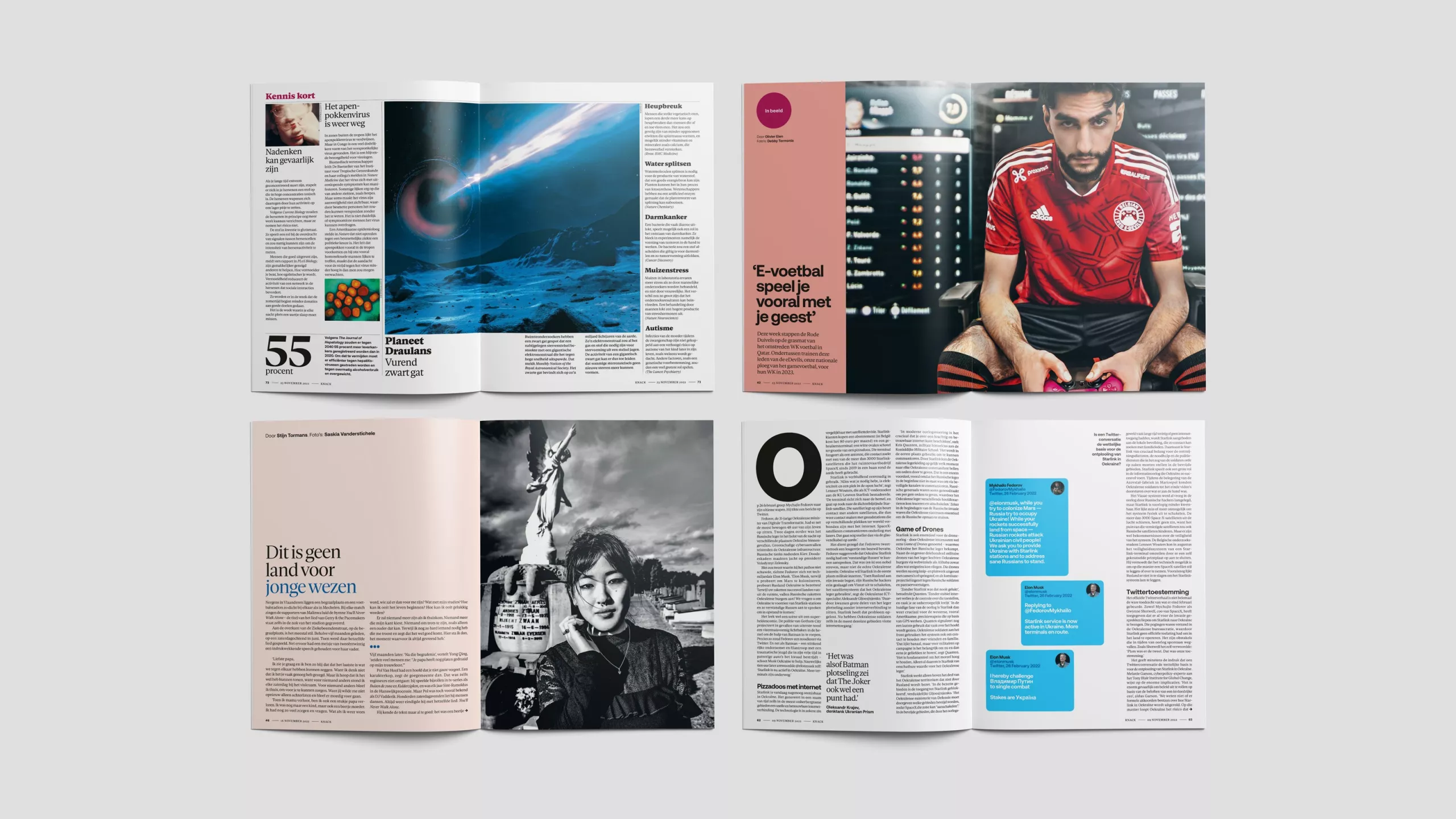
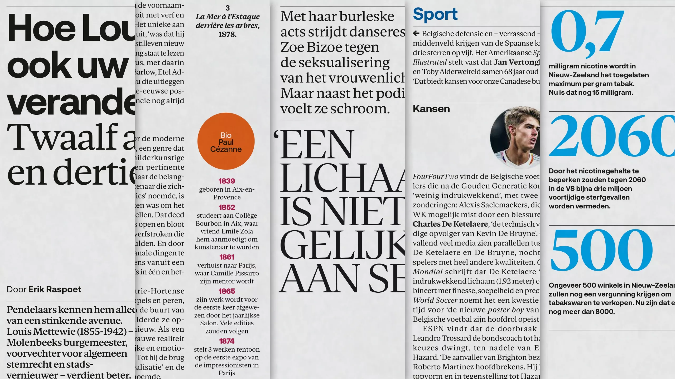
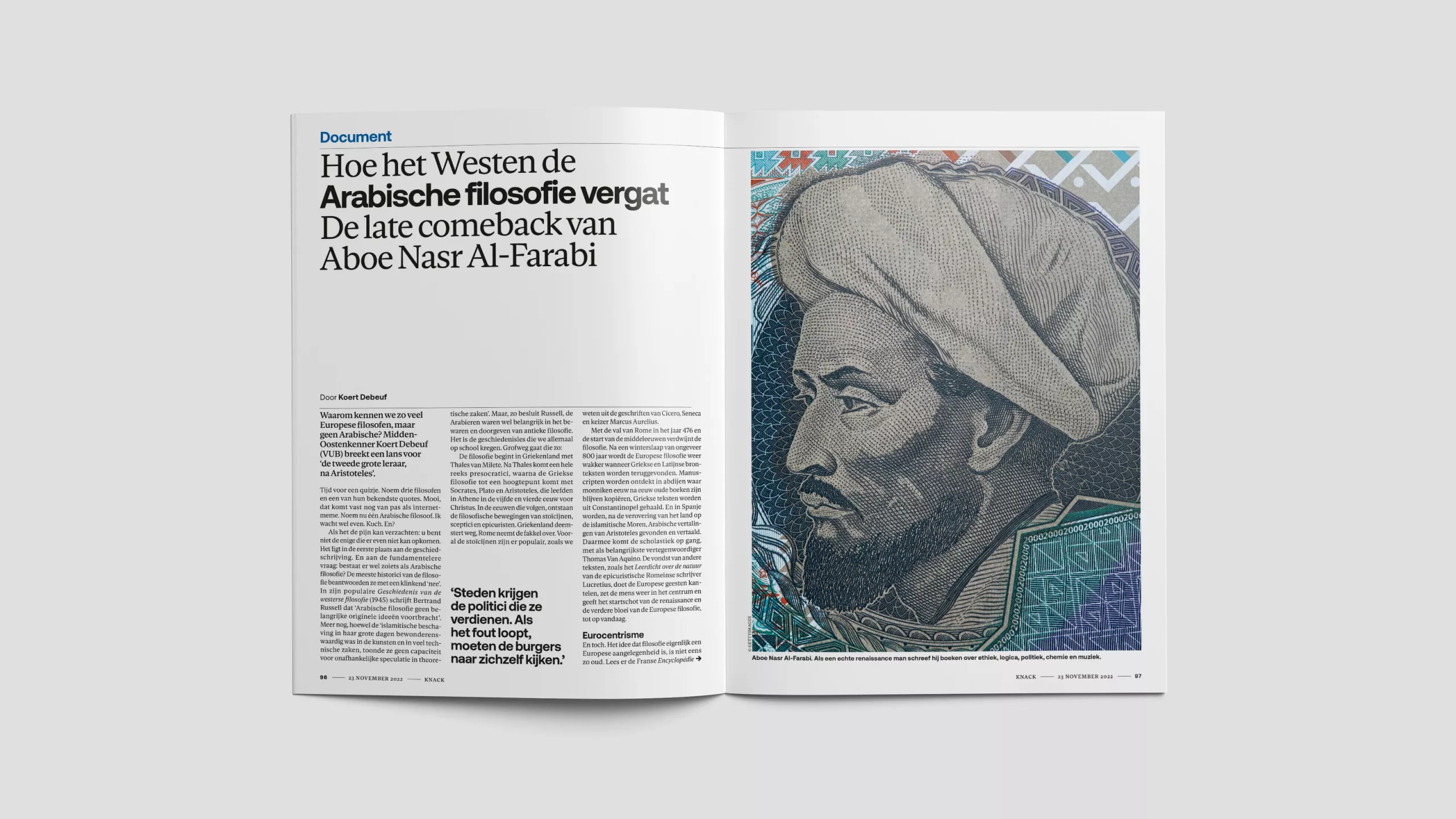
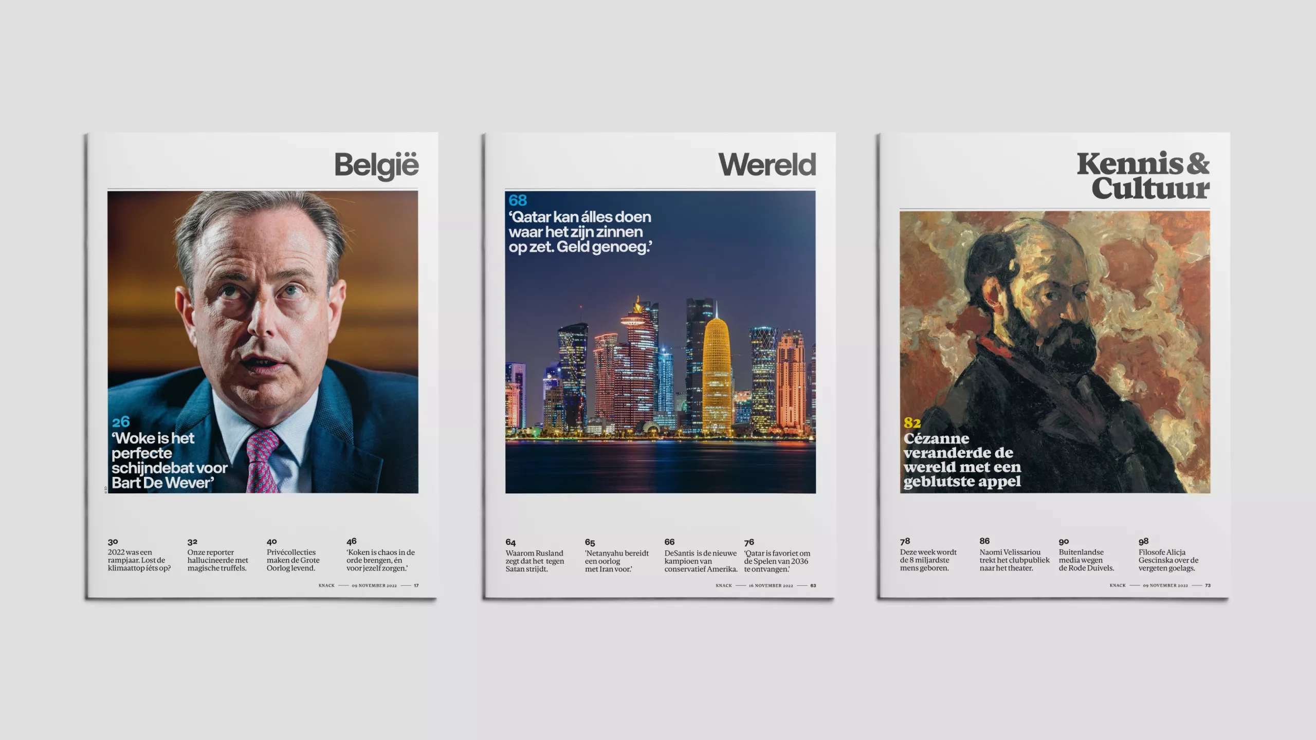
We began by focussing on usability. In recent years, Knack had become dense and confusing to read. In collaboration with the editorial team, we revised the ratio of text to image and space; devised a range of article templates which make the scale and character of the varied content more explicit to the reader; clarified and refined the labeling; and introduced a series of internal section covers to help with navigation.
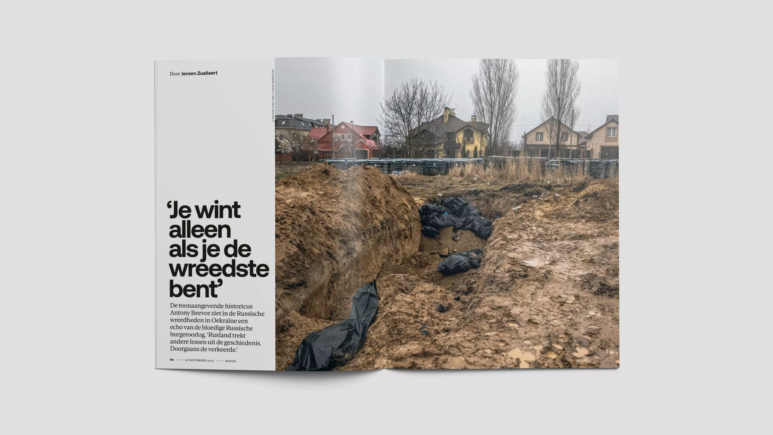
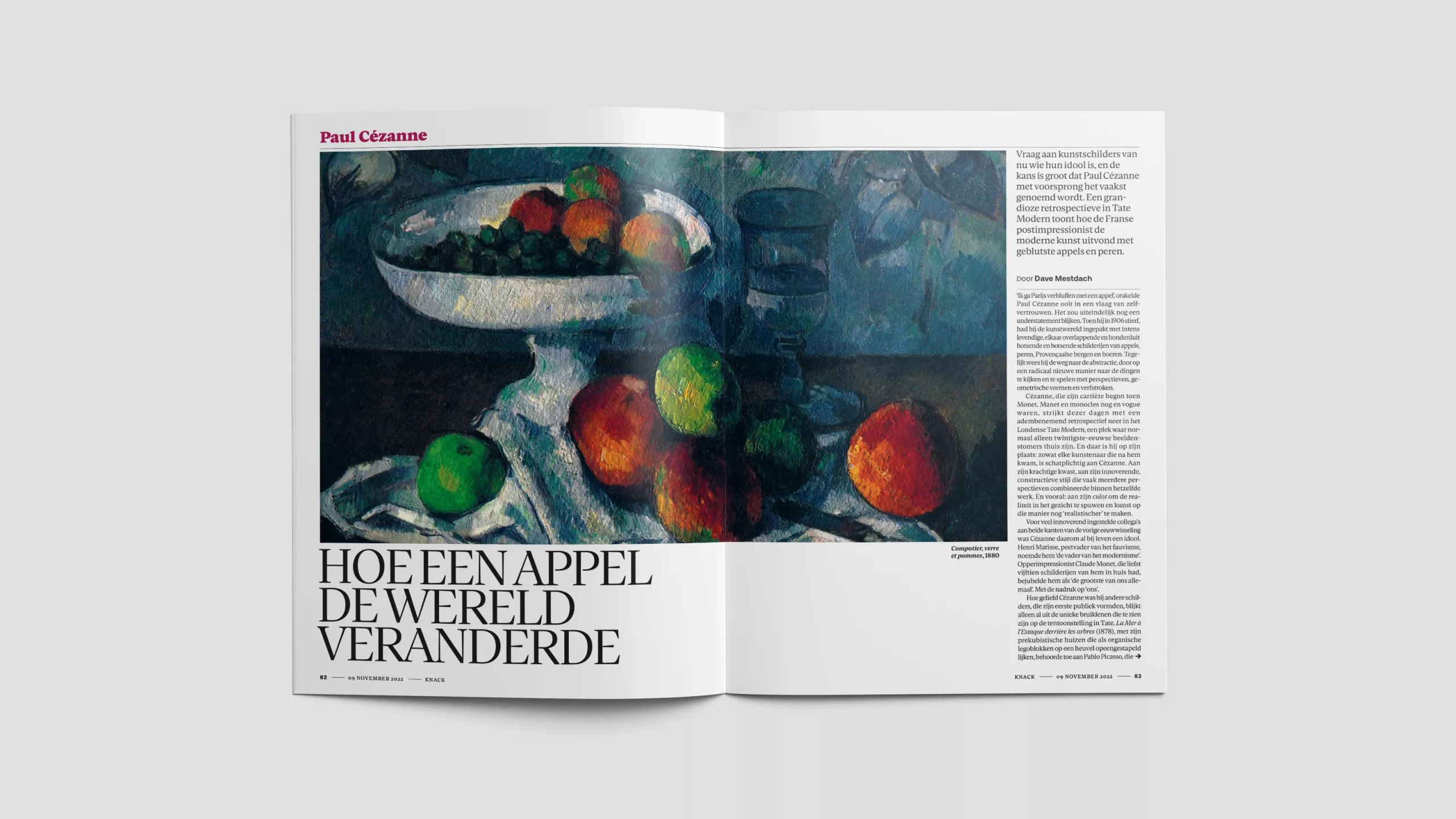
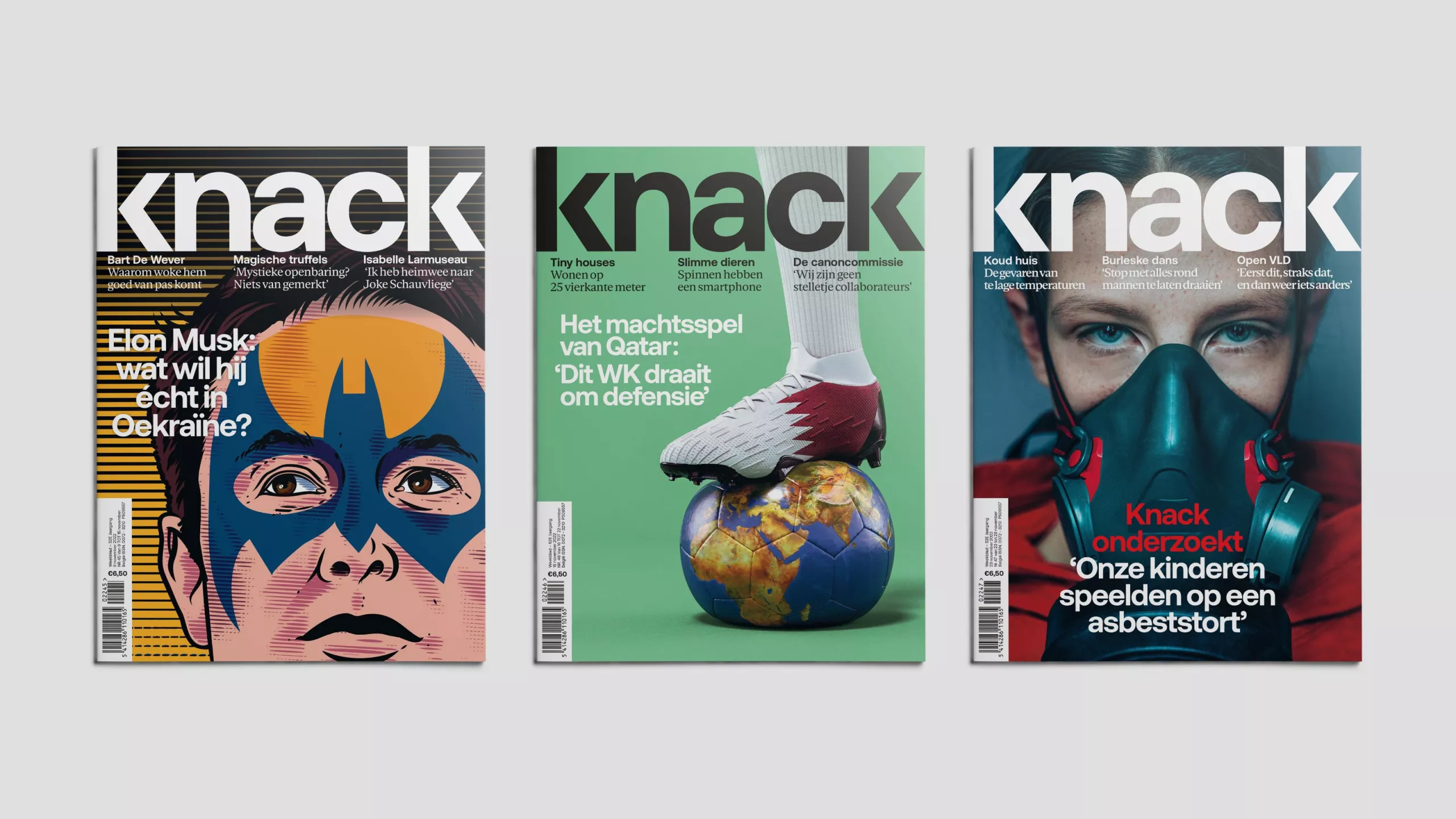
On this foundation, we built a radically new visual language. The typefaces are recent releases from contemporary designers, but retain a timeless quality. The grid system ensures variation and diversity through the run. And the new colour palette consciously avoids outdated news magazine clichés.
The result is an engaging, inclusive magazine with a fresh new aesthetic that makes Knack feel relevant again.
In-house art director: Rita Verhaege