Nature
A new design system
for the world’s
most important
science publisher
Nature is regarded as the most prestigious scientific journal in the world. Many of the most important discoveries in the history of science, including the Structure of DNA, Plate Tectonics, and the discovery of Exoplanets, were first documented in the magazine.
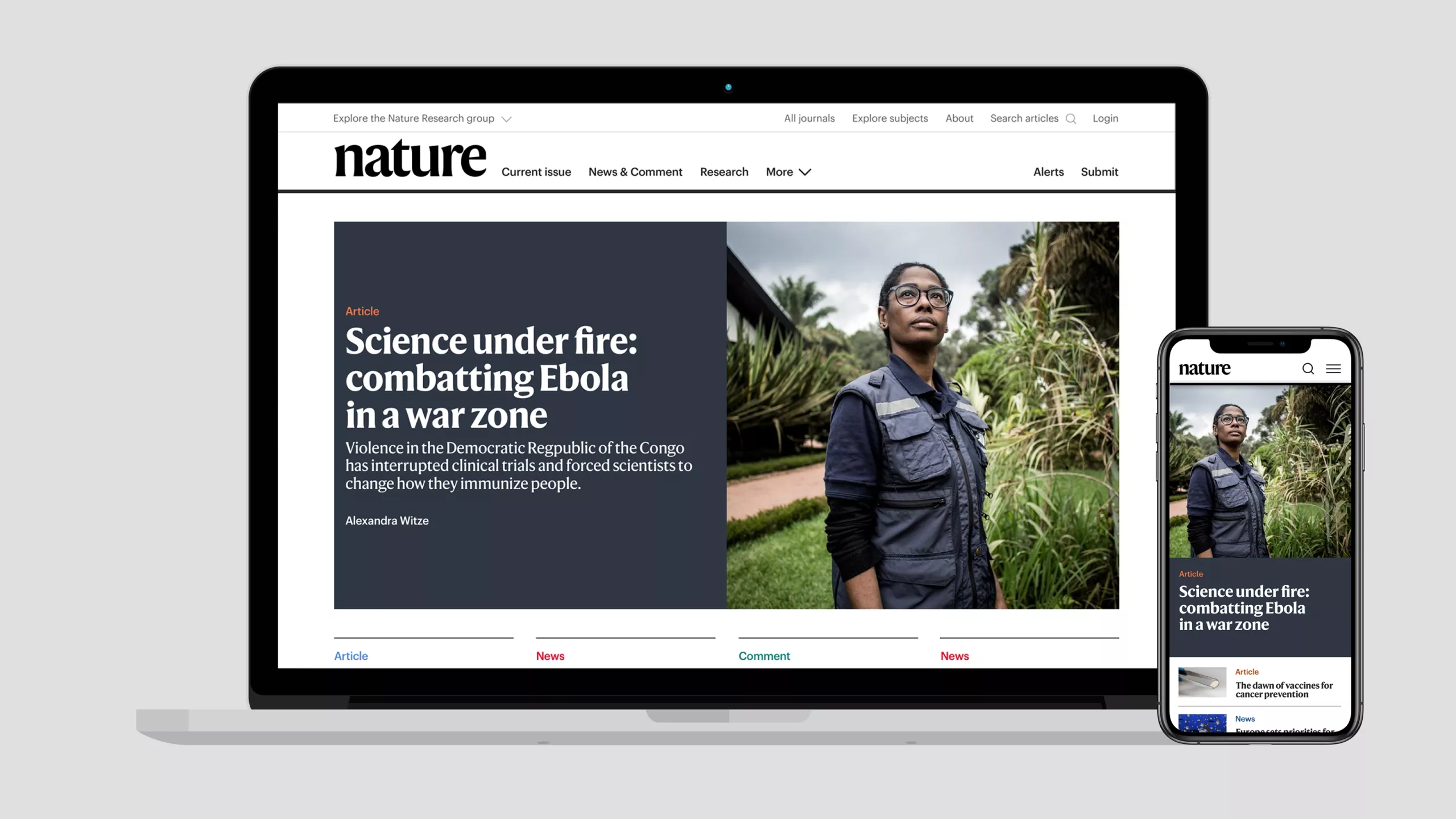
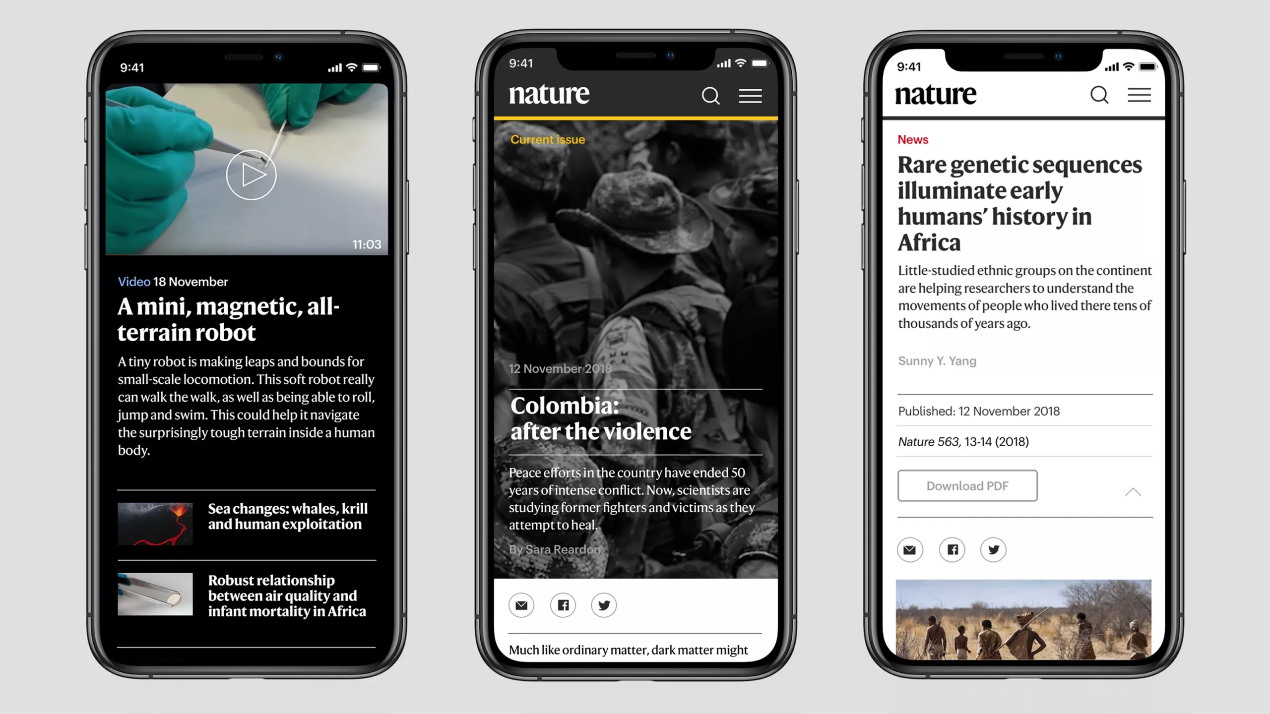
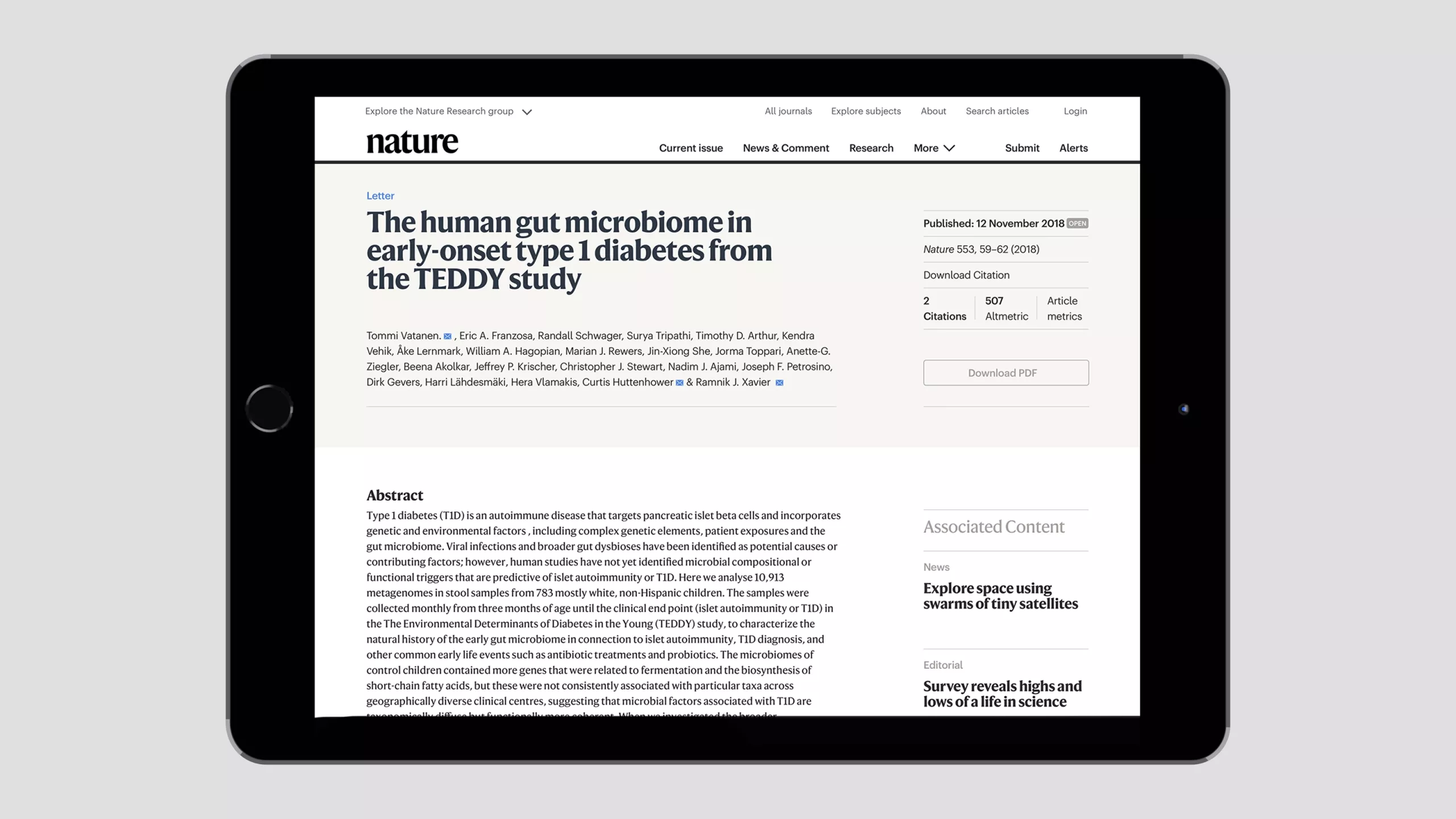
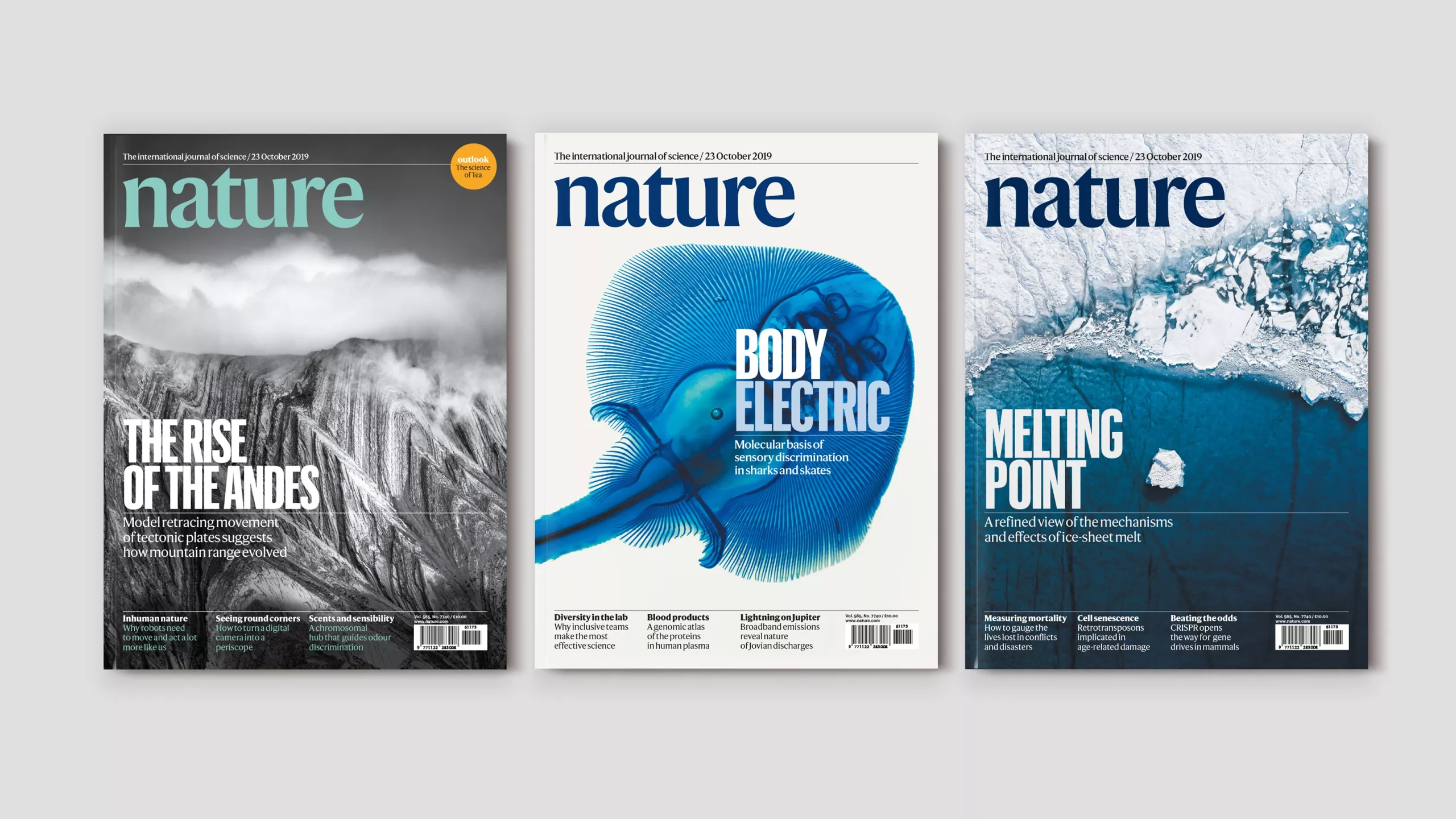
We were asked to create a new design system for Nature’s 150th anniversary, extending across the international print journal, digital, and brand identity. We worked in close consultation with the editorial, business and technology teams for over two years to bring this complex project to fruition.
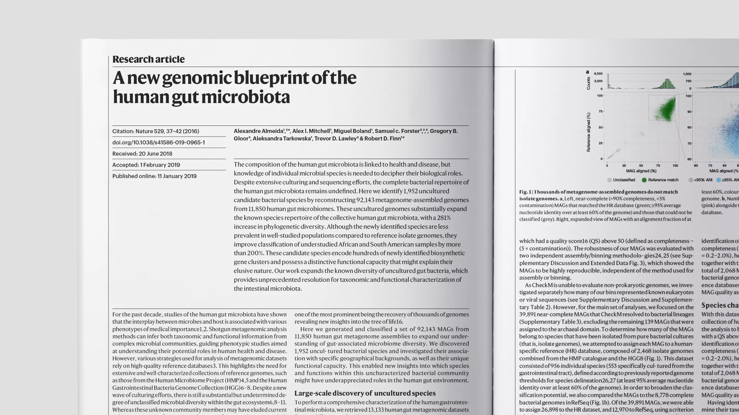
Nature’s reputation as the home of the world's best scientific research set a high benchmark, and the unique hybrid of an academic journal and a news-driven science magazine meant that tone of voice, credibility and accessibility were crucial. Nature's print and web readers are probably the most demanding audience we have designed for, so we had to be on our mettle.
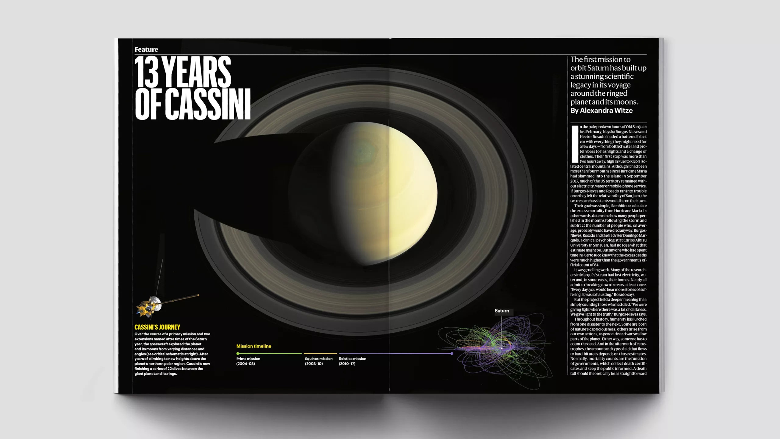
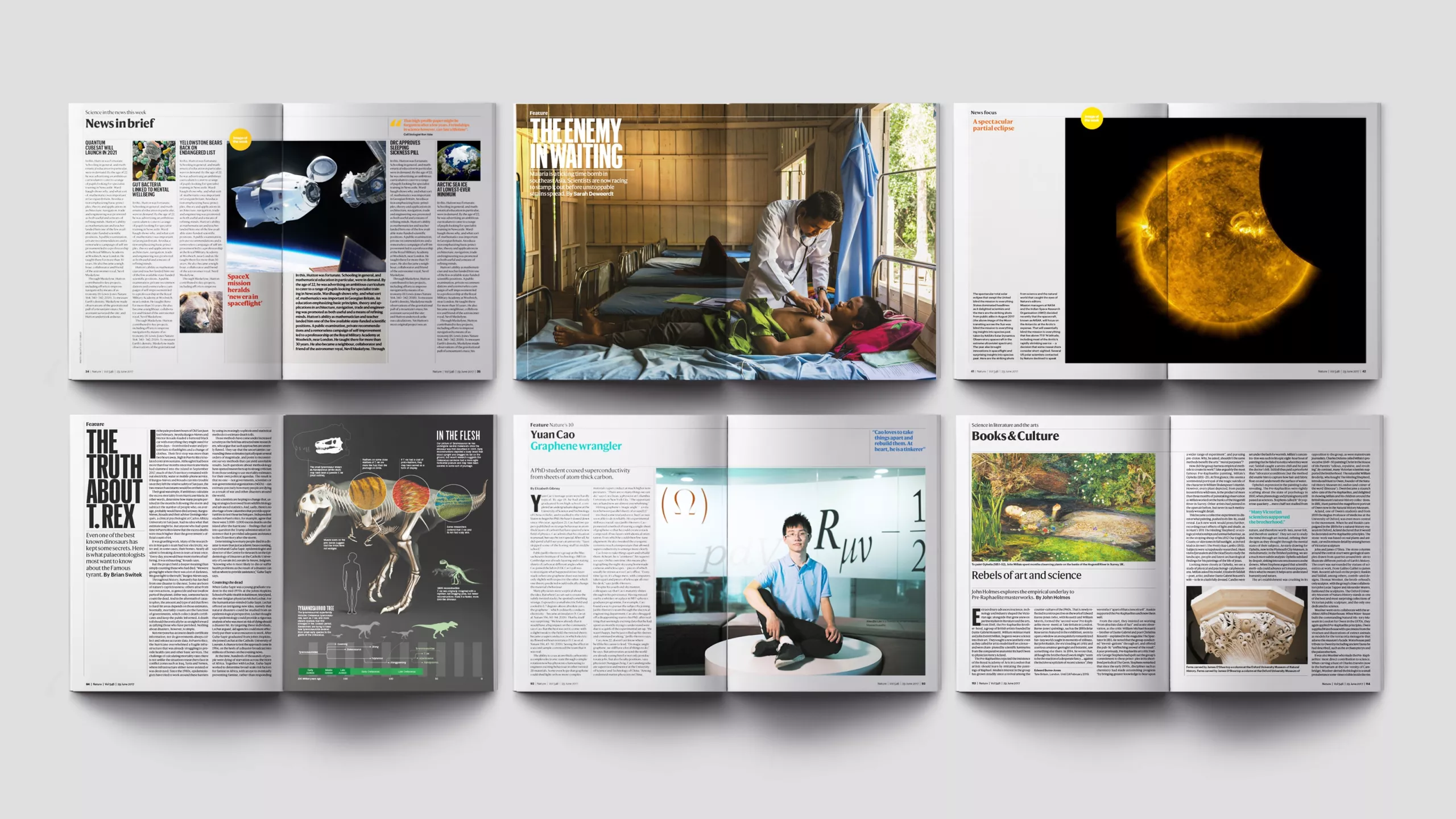
The new design balances Nature’s editorial voice and rich history with rigorous communication of scientific information, delivering a great experience for both general readers and expert scientists.
We also introduced an exclusive new custom typeface family from renowned font foundry Commercial Type, which aims to be the most functional and complete science typeface in the world.
The print design and brand identity are now live, and the digital project will roll out in the coming months.
In-house creative director: Kelly Krause