Público
A bold redesign for
a definitive intelligent
European tabloid
Although Público was only launched in 1990, it immediately found an important role as a liberal voice in post-dictatorship Portugal.
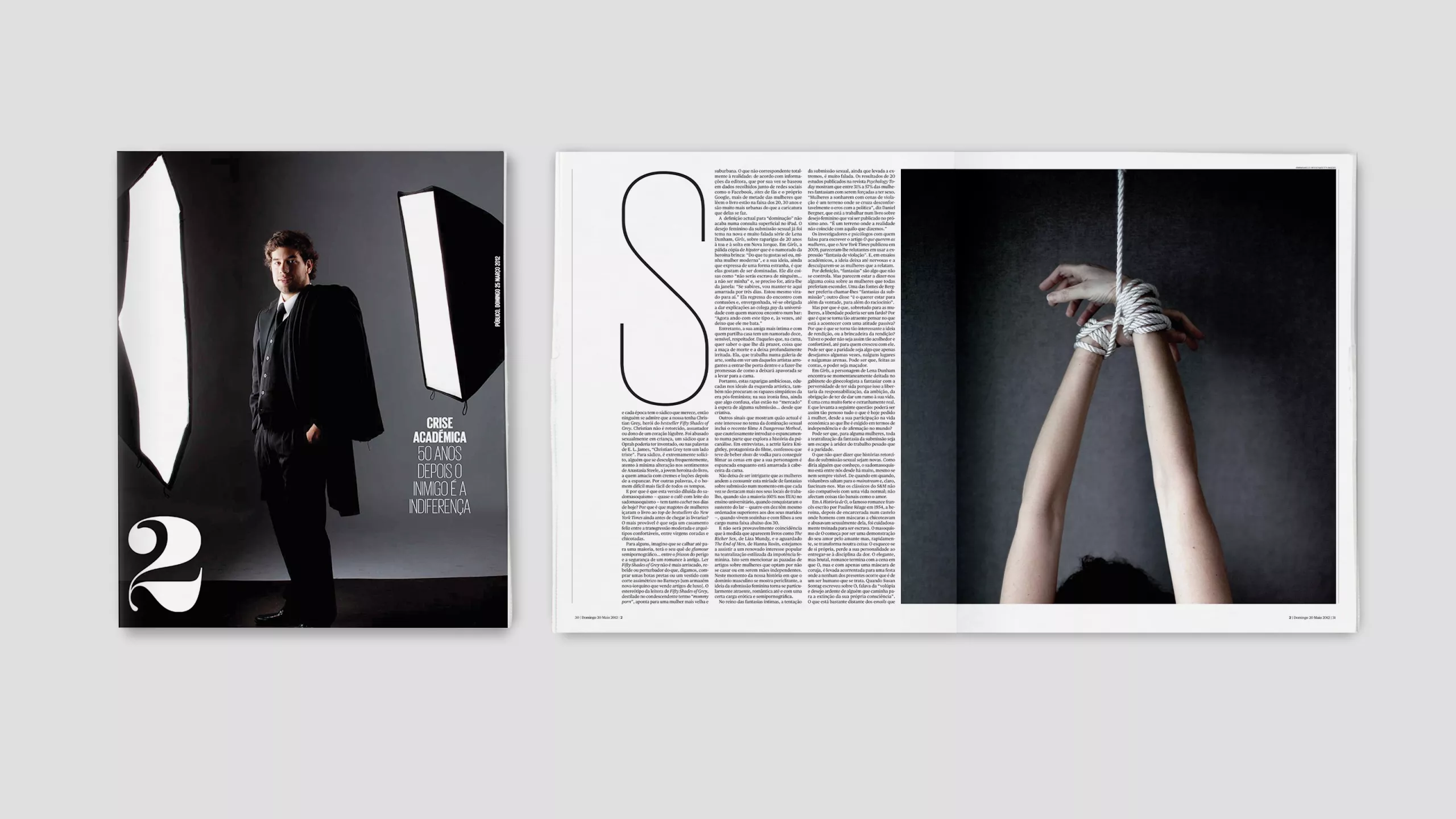
In its early years, Público acquired a reputation as a home for great writers and deep thinking, but also for a text-heavy design that was looking increasingly dated. We were asked to reinvent it as a truly modern newspaper, with visual journalism to match the standards of the writing and editing.
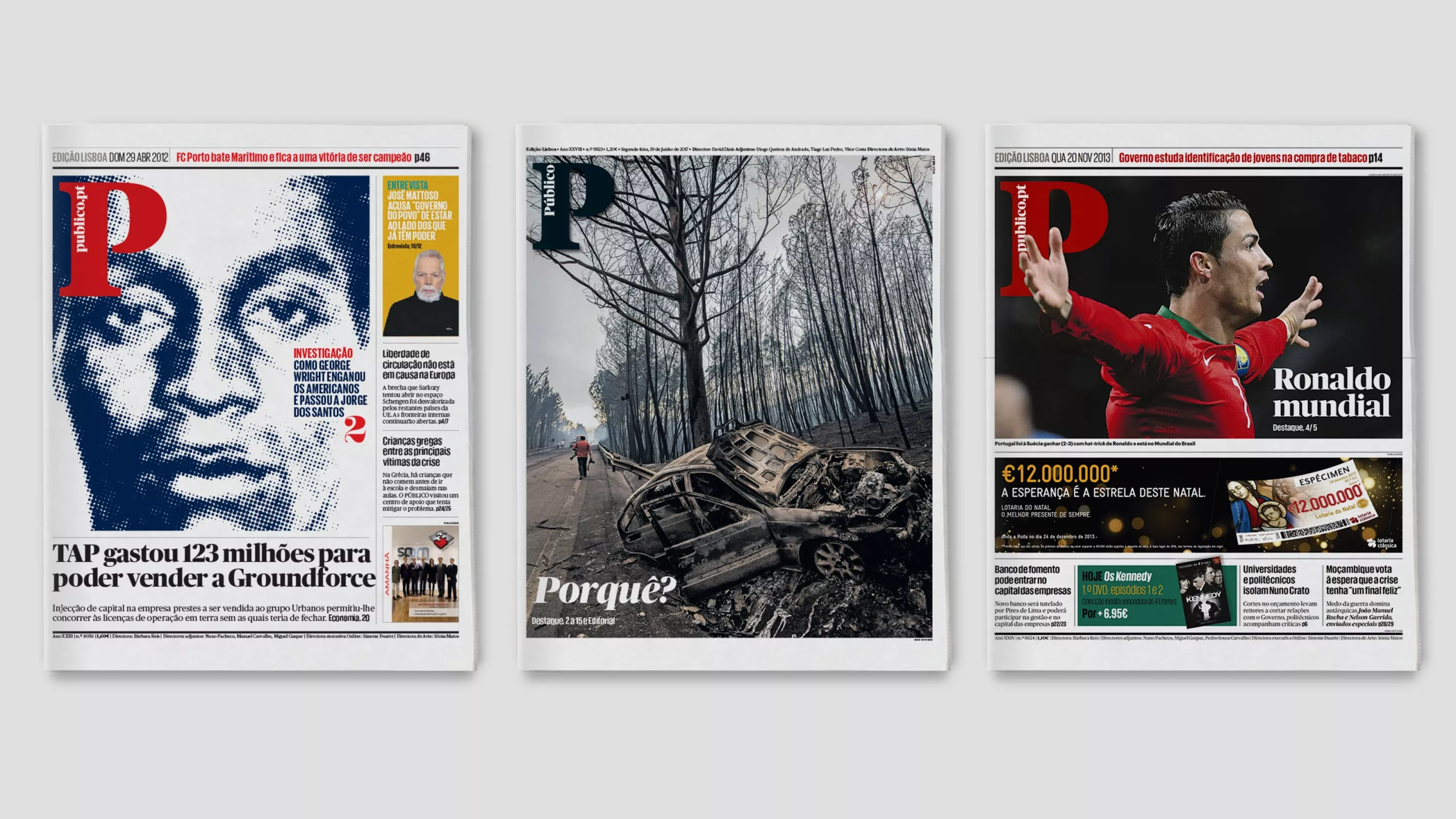
We created an influential and multi-award-winning design which also proved to be a sound foundation for expansion into the digital era. The key brand assets — the rich Portuguese red and the iconic “P” logo — have become cornerstones of a broad design system with many applications.
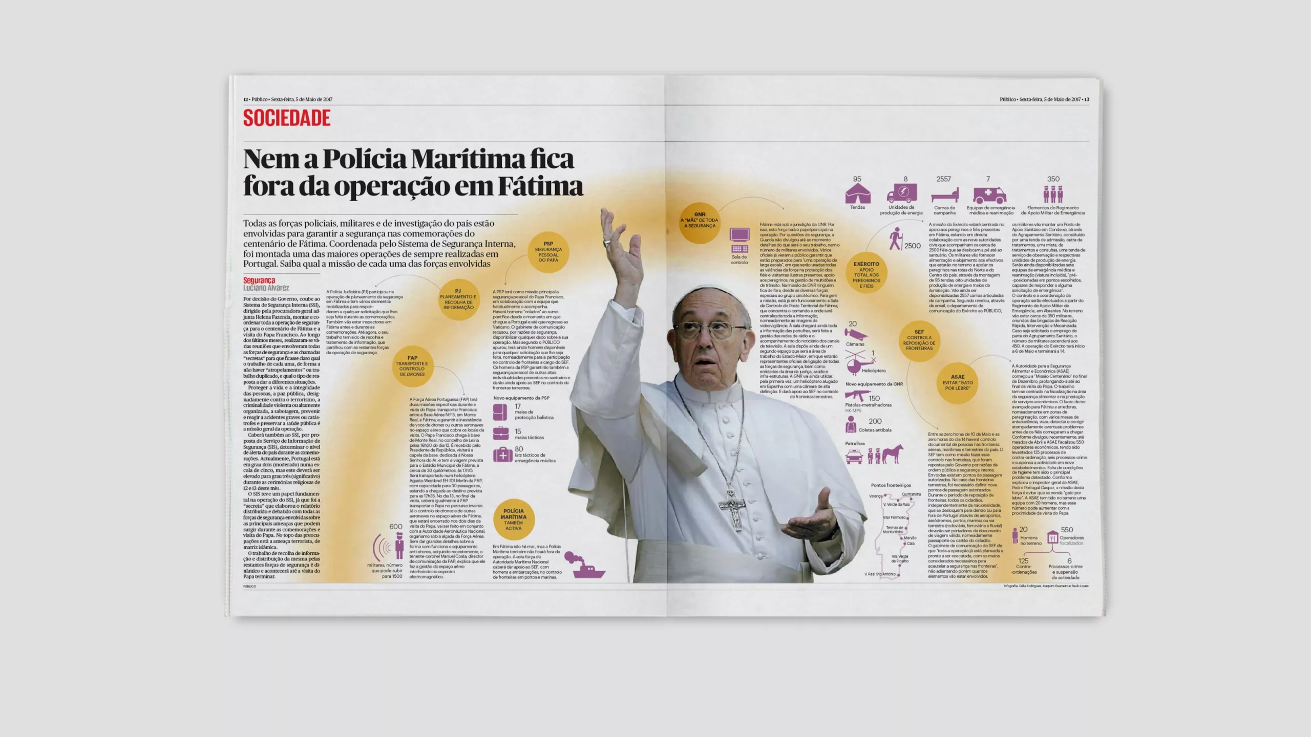
When working as an external consultant, it is important to ensure that a project is not only delivered, but embraced by the client and embedded in their culture. Público is a great example. In-house creative director Sonia Matos has made the very most of our design, using it as a platform for some brilliant visual storytelling, and it still looks as impressive as the day it was launched.
This project also had an unexpected outcome. The Público font family that we commissioned from our friends at Commercial Type has become one of the the most popular typefaces in the world. It has been used in newspapers on every continent, in hundreds of magazines and websites, and has now been adopted by more than one international corporation.
Collaboration: Esterson Associates.
Creative directors: Mark Porter, Simon Esterson.
In-house creative director: Sonia Matos