De Tijd and L’Echo
Bilingual design
for Belgium’s
leading financial
newspapers
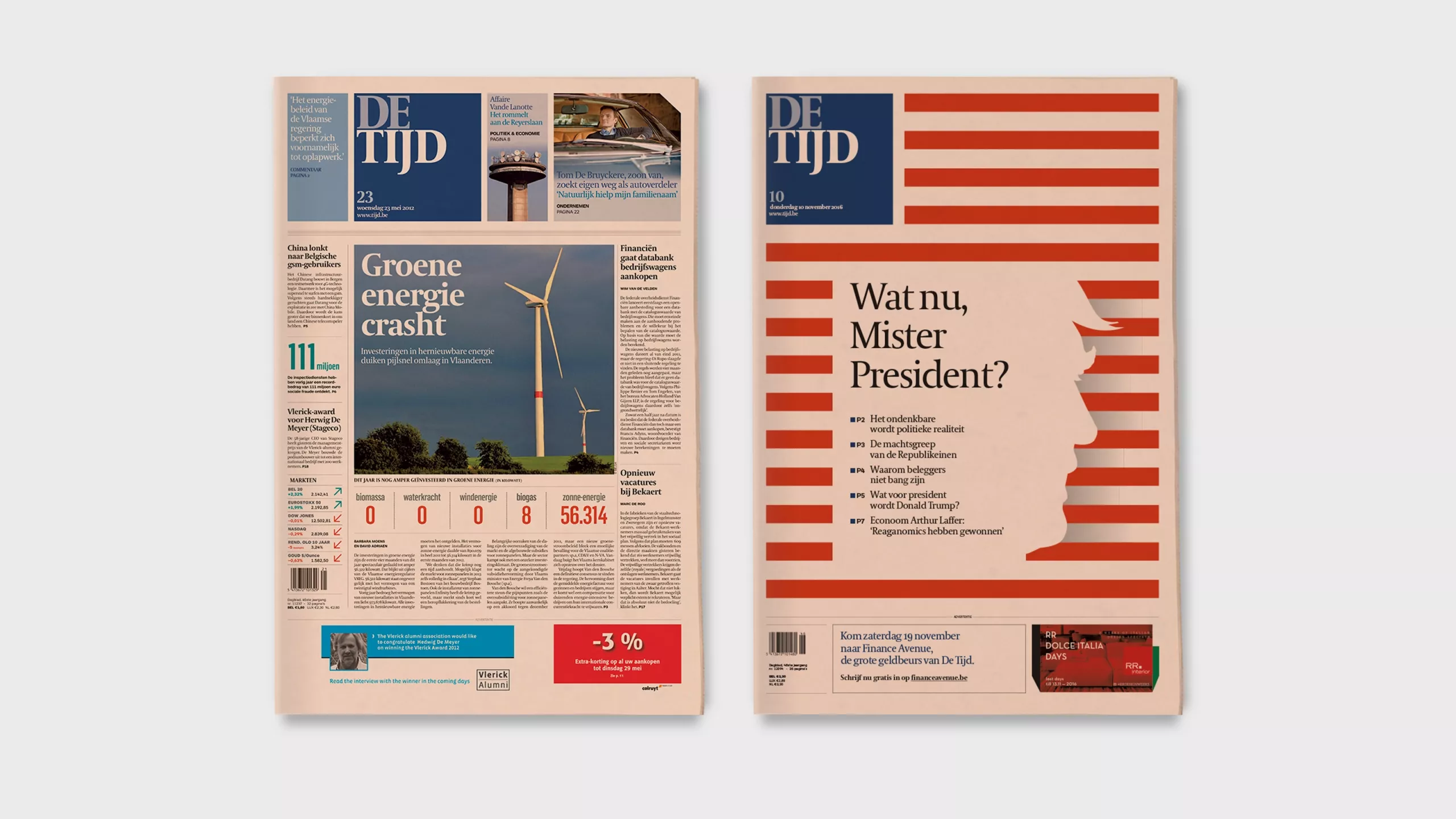
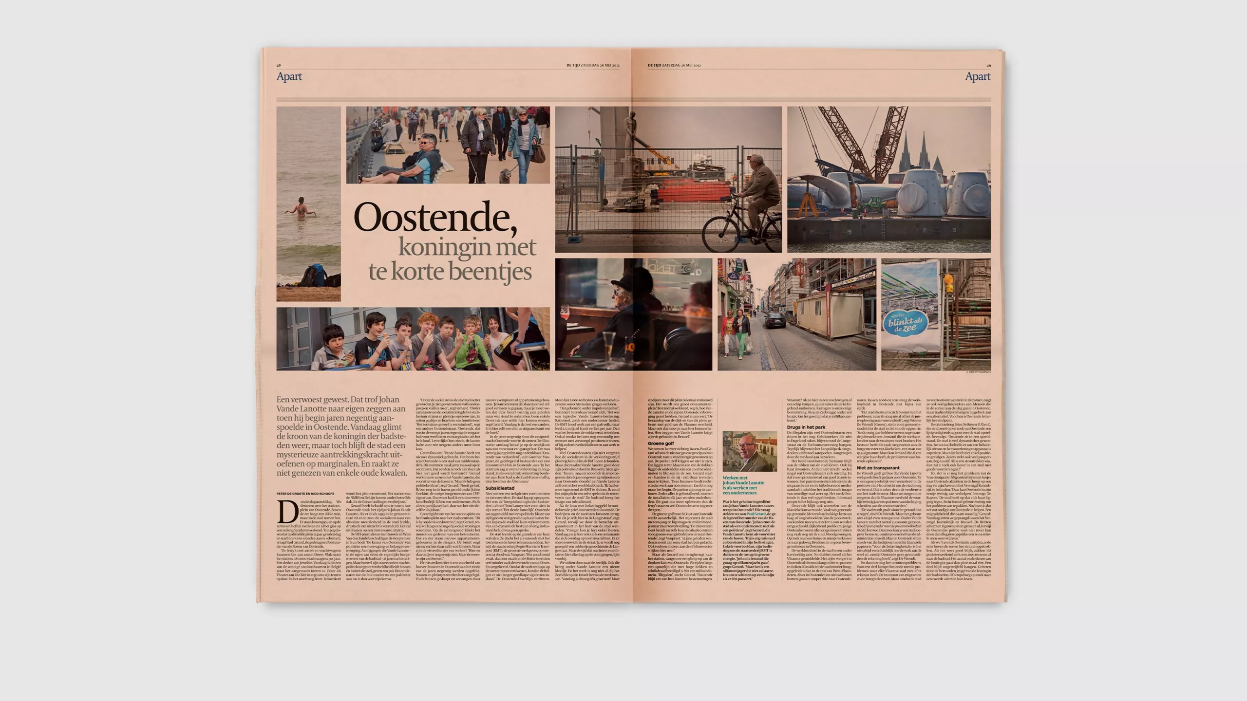
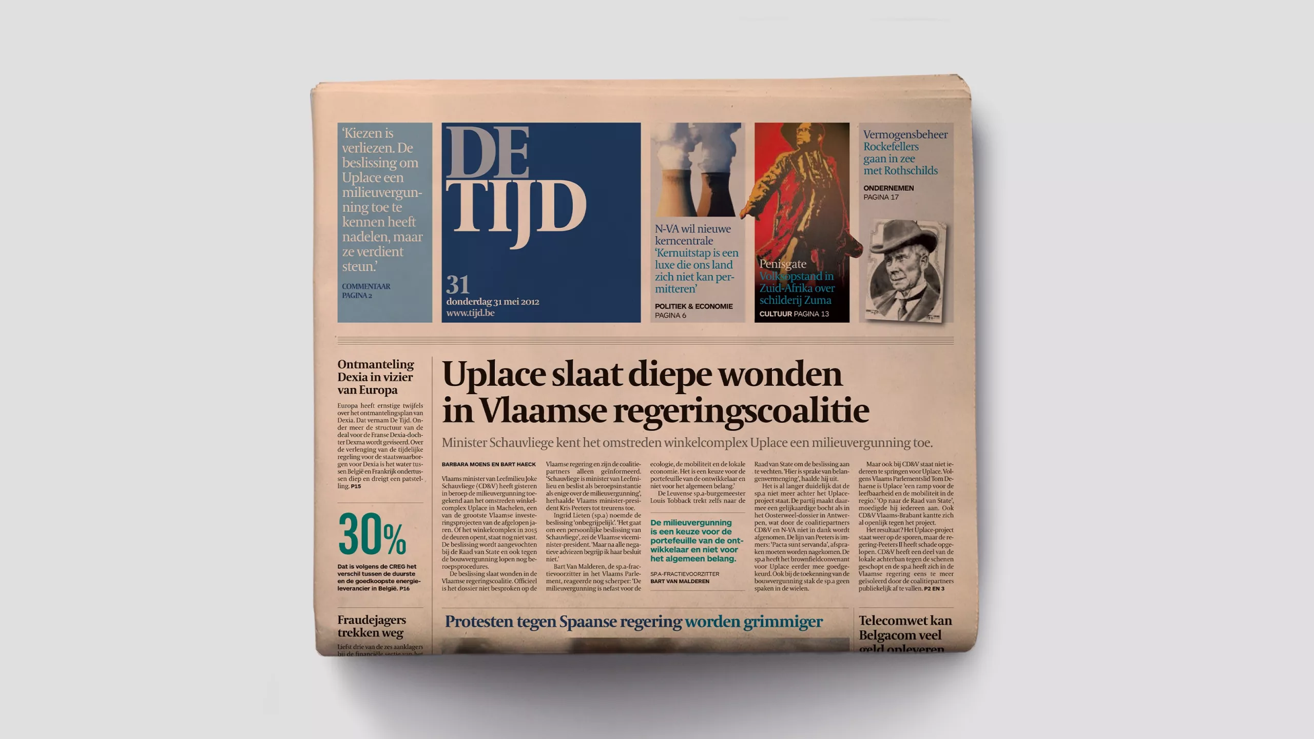
Brussels is the political heart of the European Union, and Belgium's dynamic business scene is covered by two sister papers printed on salmon pink paper.
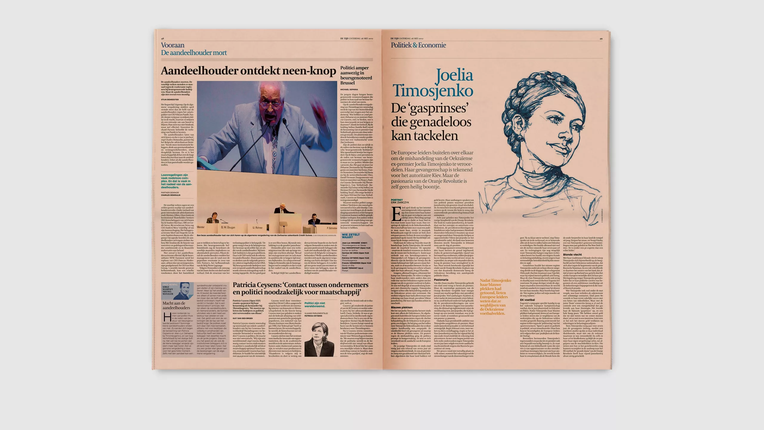
De Tijd is published in Flemish and L’Echo in French. They have different editorial teams and different content but share a publisher and a philosophy, and they wanted to look the same, only different!
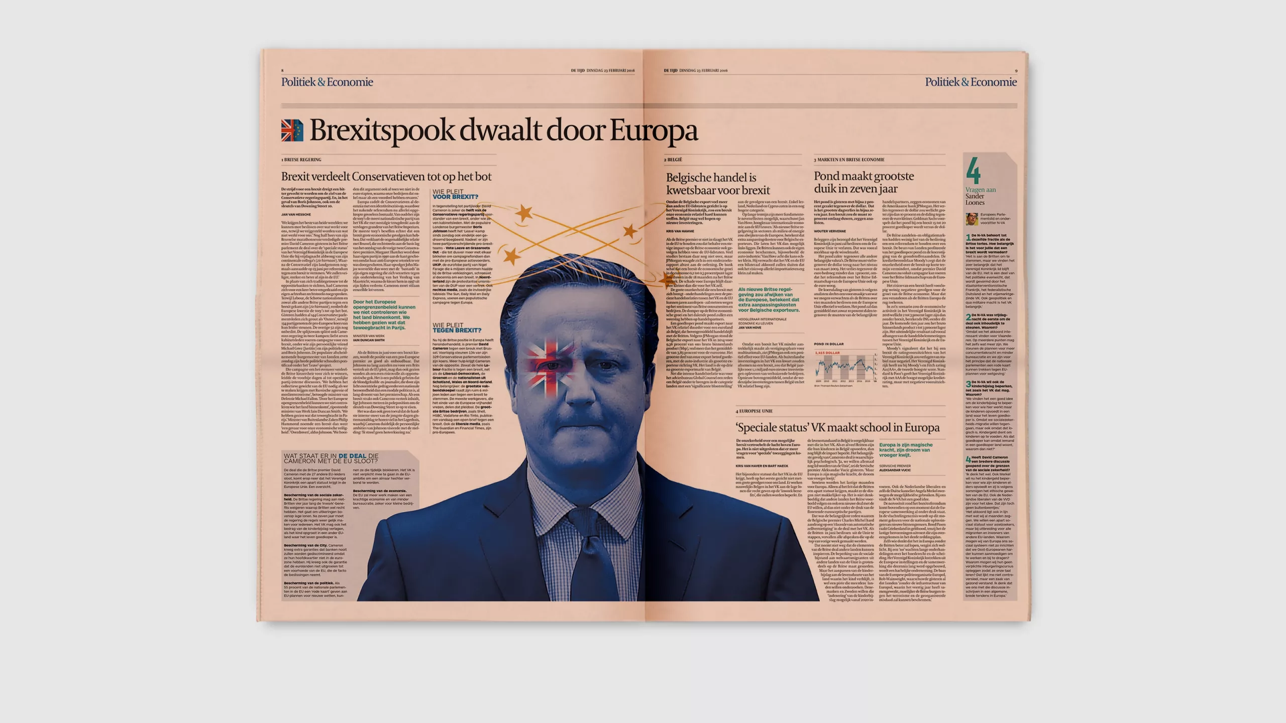
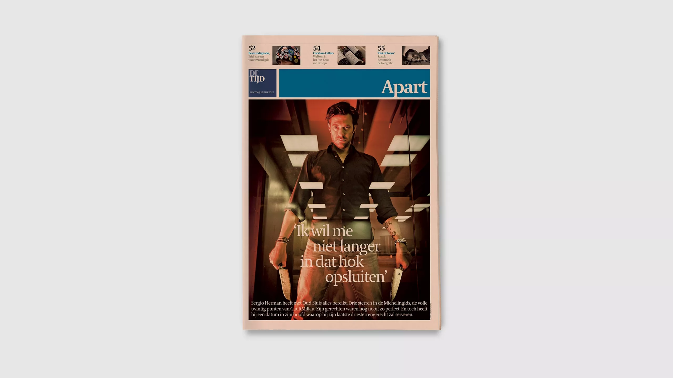
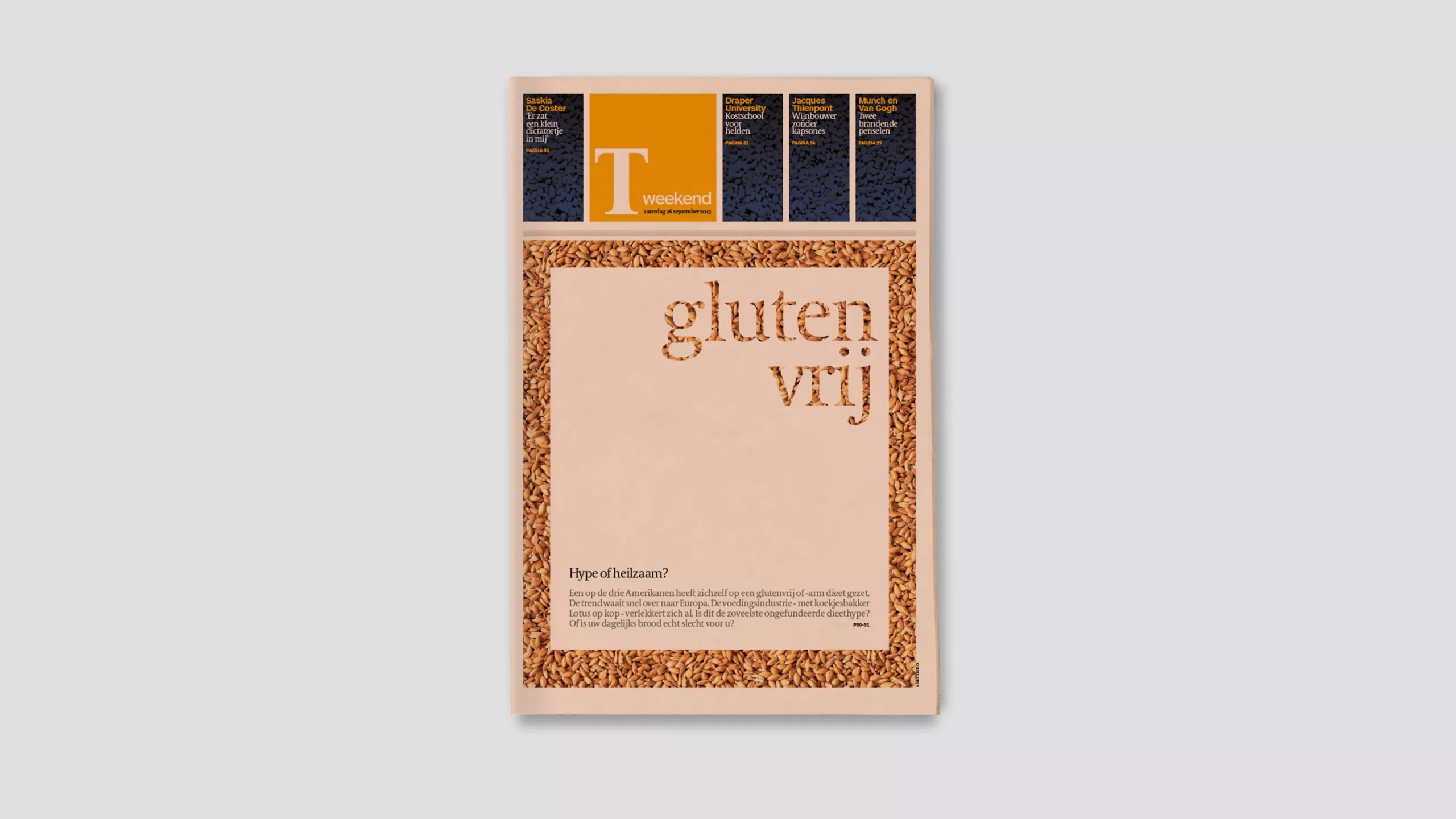
We gave them a classical typographic structure appropriate to their upscale business readership, combined with a rich library of page elements for secondary information and data, and a bold use of colour. The new design was an immediate success and we have since returned to work on new front page styles and weekend sections.
We love it when the in-house team picks up our design and runs with it. Since our project was implemented, the design and graphics team at De Tijd has gone on to win multiple awards, including best Designed Newspaper in Europe.
In-house art director: Jan Nelis.
Inforgraphics and illustration: Filip Ysenbaert
