L’Express
A contemporary
visual languge
for a classic weekly
news magazine
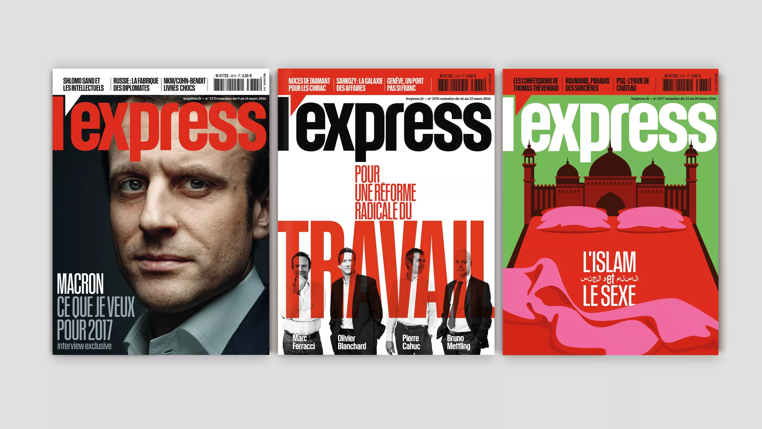
L’Express is a Paris-based news magazine with an illlustrious past. Its high-profile contributors have included Jean-Paul Sartre, François Mauriac, and other titans of French culture. We were asked to reposition the magazine to attract a wider audience and reaffirm its leading position in its market.
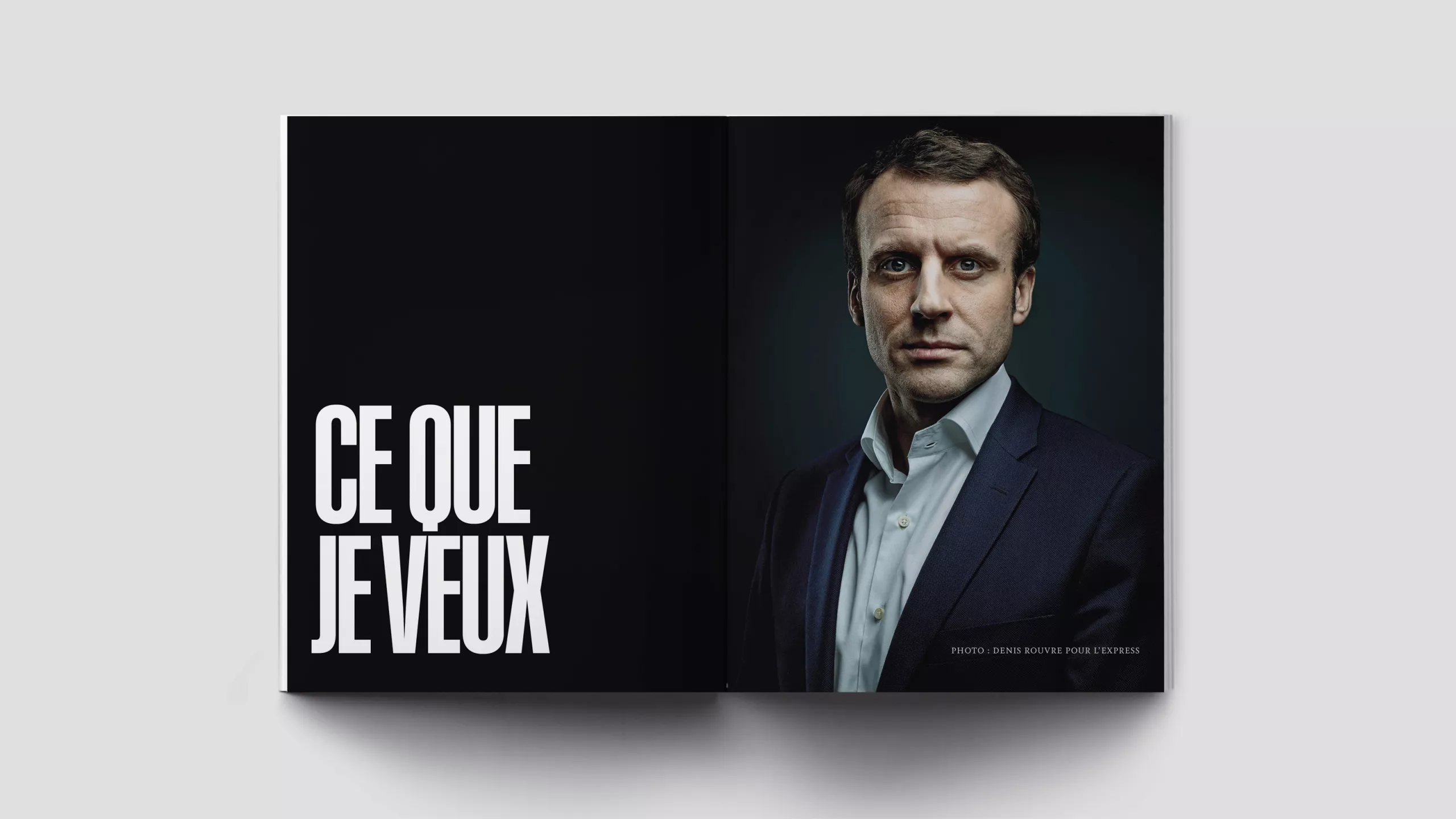
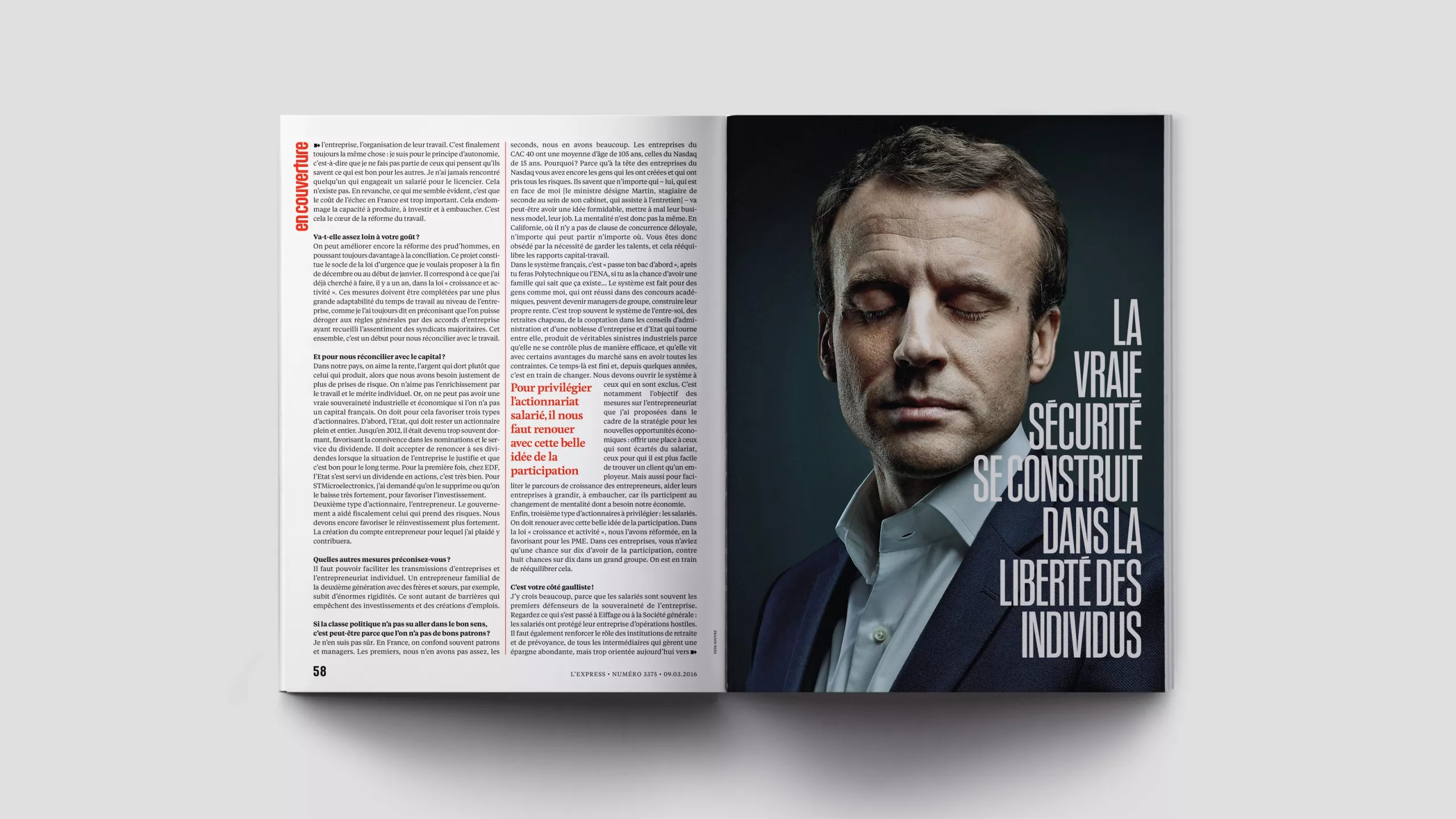
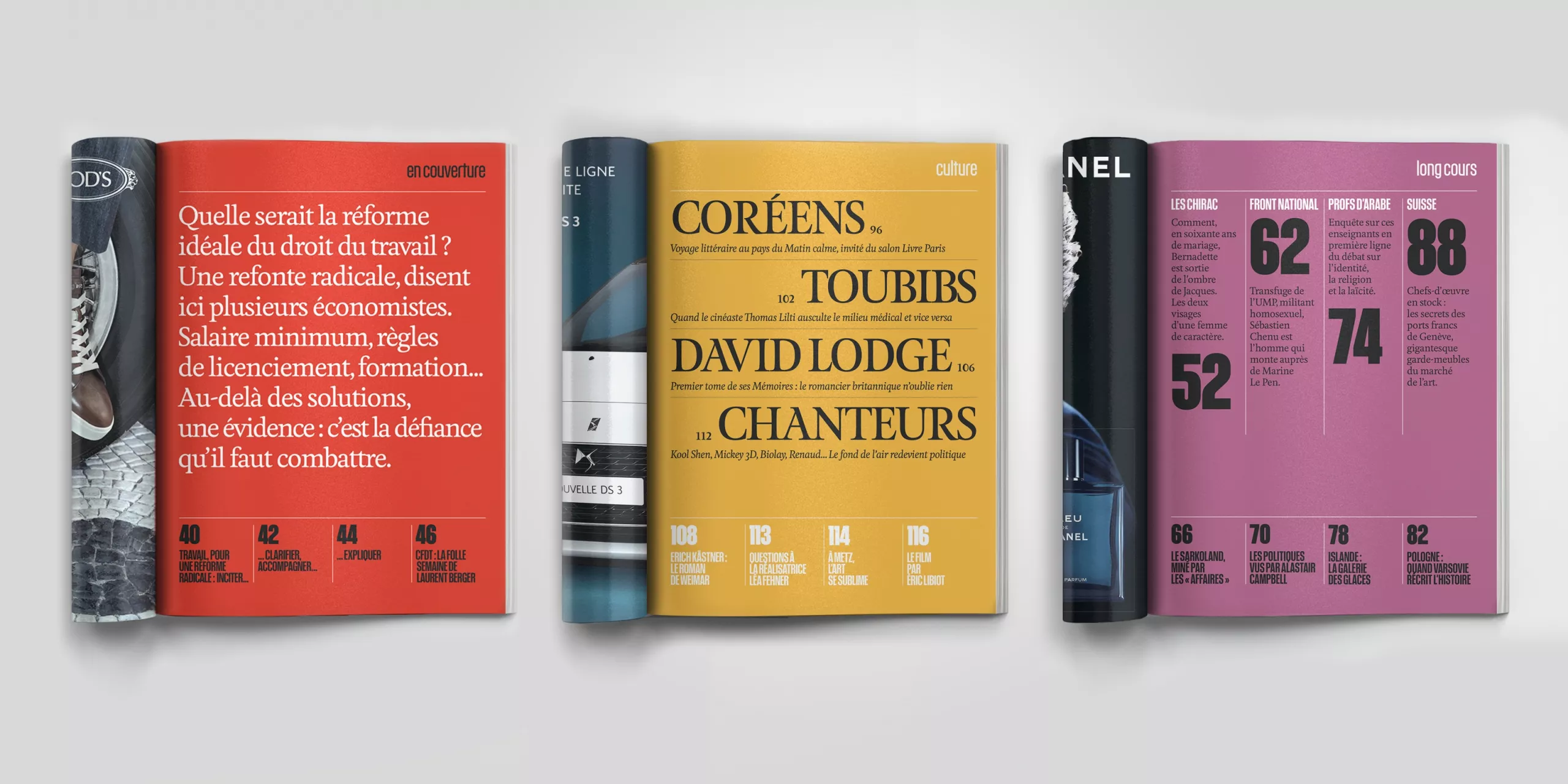
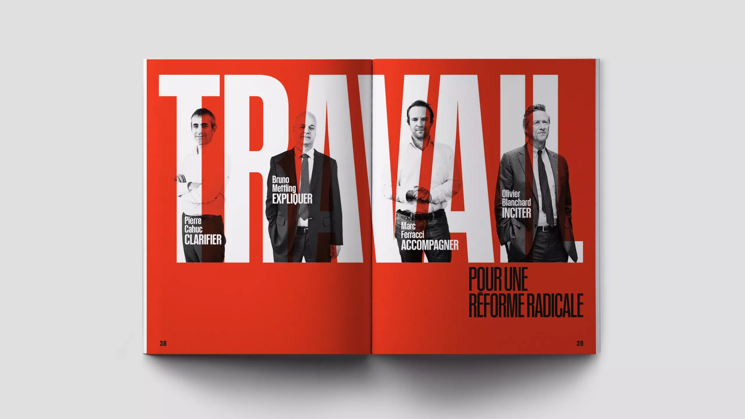
We began by asking what a weekly news magazine should look like in an age when news and opinion can be found instantly online. There is an established graphic language for the classic news weekly, based on sans-serif typography, a colour palette of black and red or orange, and a conventional style of photography and graphics. The question was whether to respect those conventions, or to ignore them and reinvent the medium. We decided to work within the framework, but make it relevant to the 21st century.
In our research in the archives, we found many design elements from the 1960s and 1970s which still resonated. We mixed them with a modern approach to typography and image to produce a news weekly for a contemporary audience. L’Express relies on newsstand sales, so a bold, distinctive logo and a punchy cover format were also crucial.
The rebrand was a resounding success with readers and advertisers. On the day of the relaunch, even Bernard Henri-Lévy, France’s most famous philosopher and cultural commentator, tweeted: “Bravo, bravo, bravo!”
Creative director: Mark Porter.
Senior art director: Mark Leeds