Prospect
Intelligent design
for “slow journalism”
When Alan Rusbridger (formerly editor of The Guardian) returned from academia to become editor of Prospect, we were thrilled to collaborate with him again on a new design project.
Prospect’s rallying cry is “Escape the echo chamber”. The thoughtful in-depth reporting, analysis and opinion from a distinguished roster of contributors have made it a must-read title for senior figures in government, policy-making and business. Rusbridger describes it as a “small (but growing) voice of calm at a time when so many people feel they have to shout to be heard.” Our mission was to create a design that reflects this distinctive character.
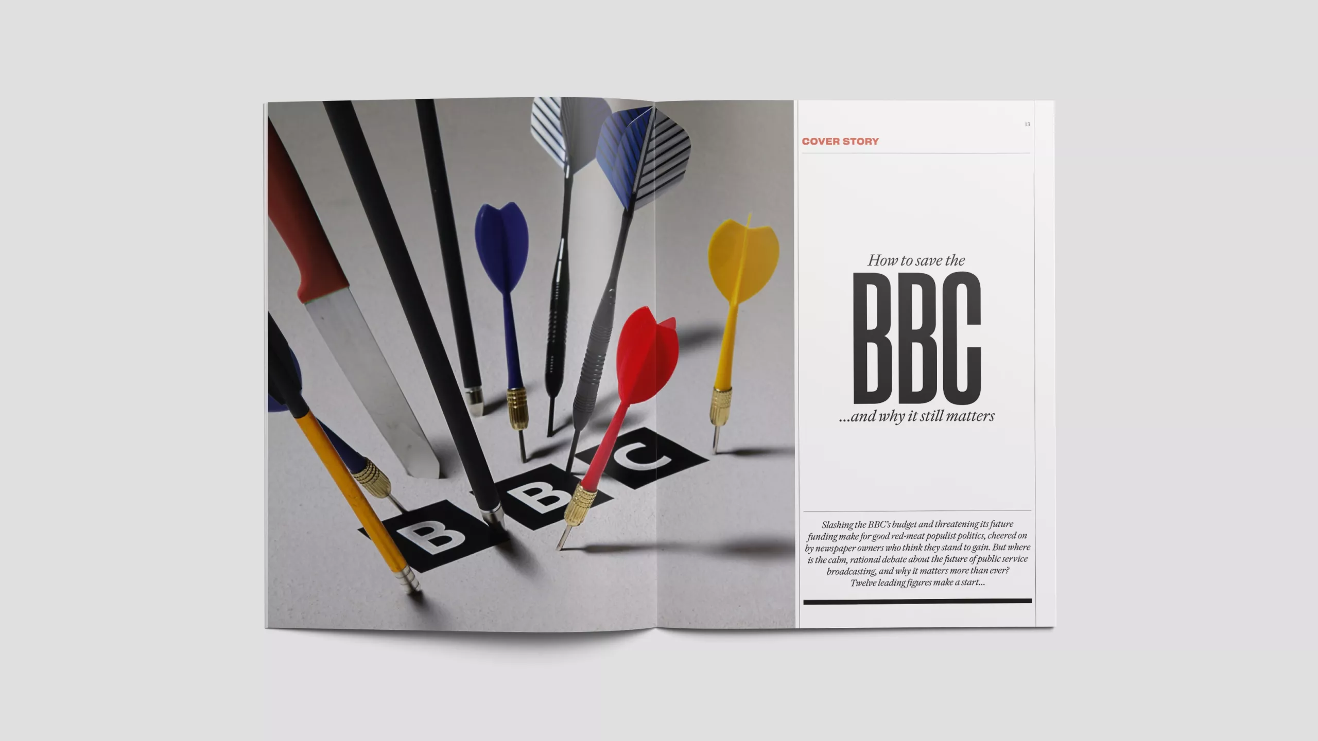
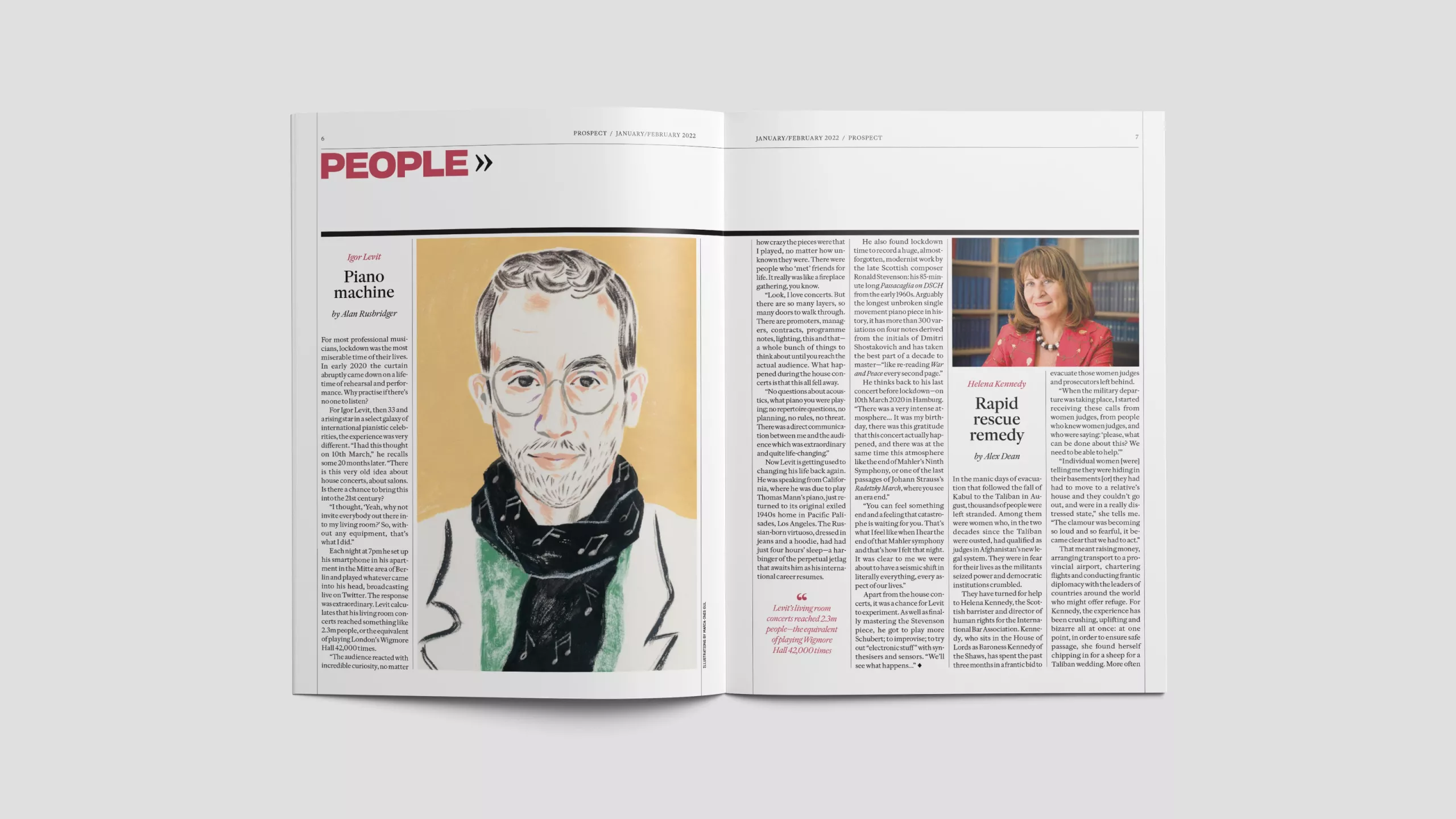
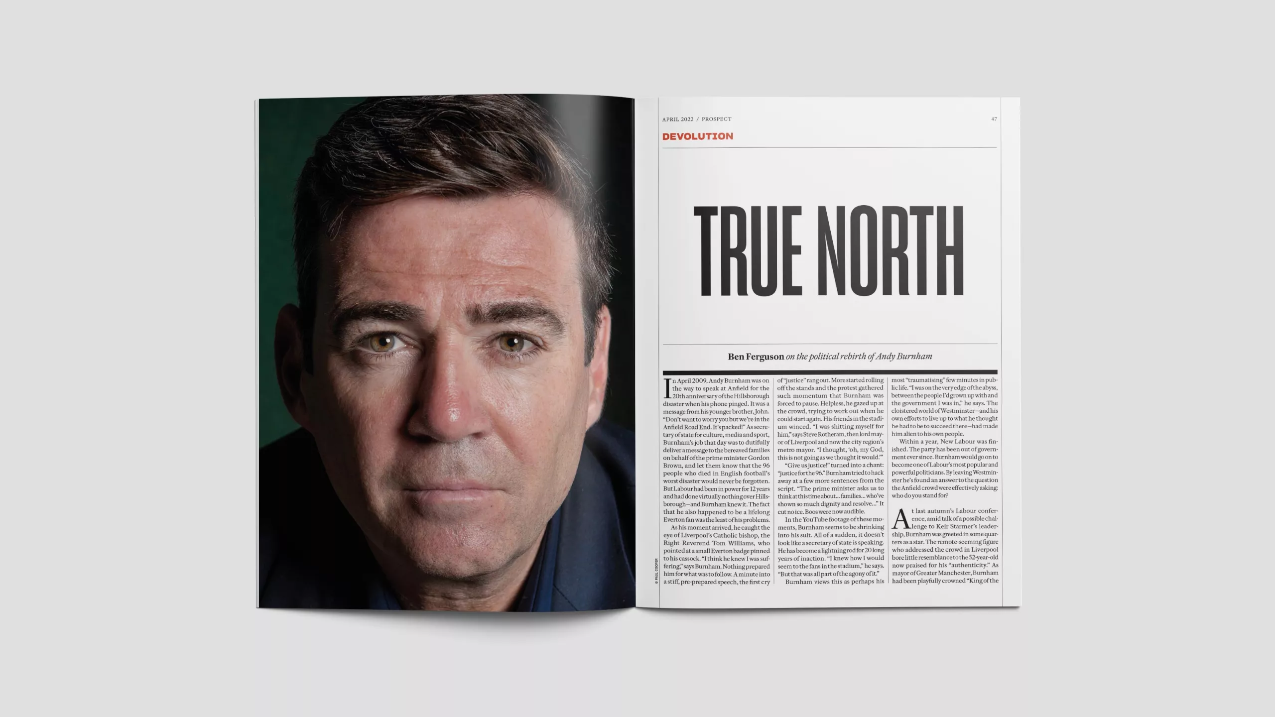
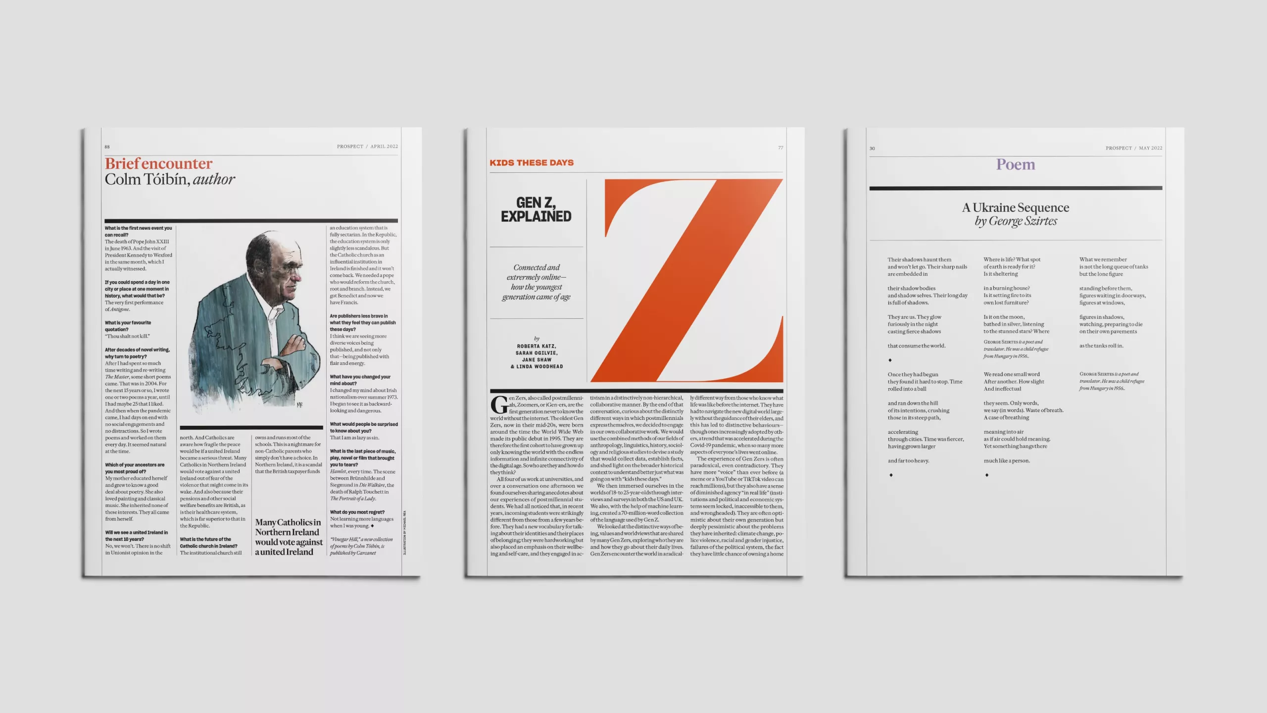
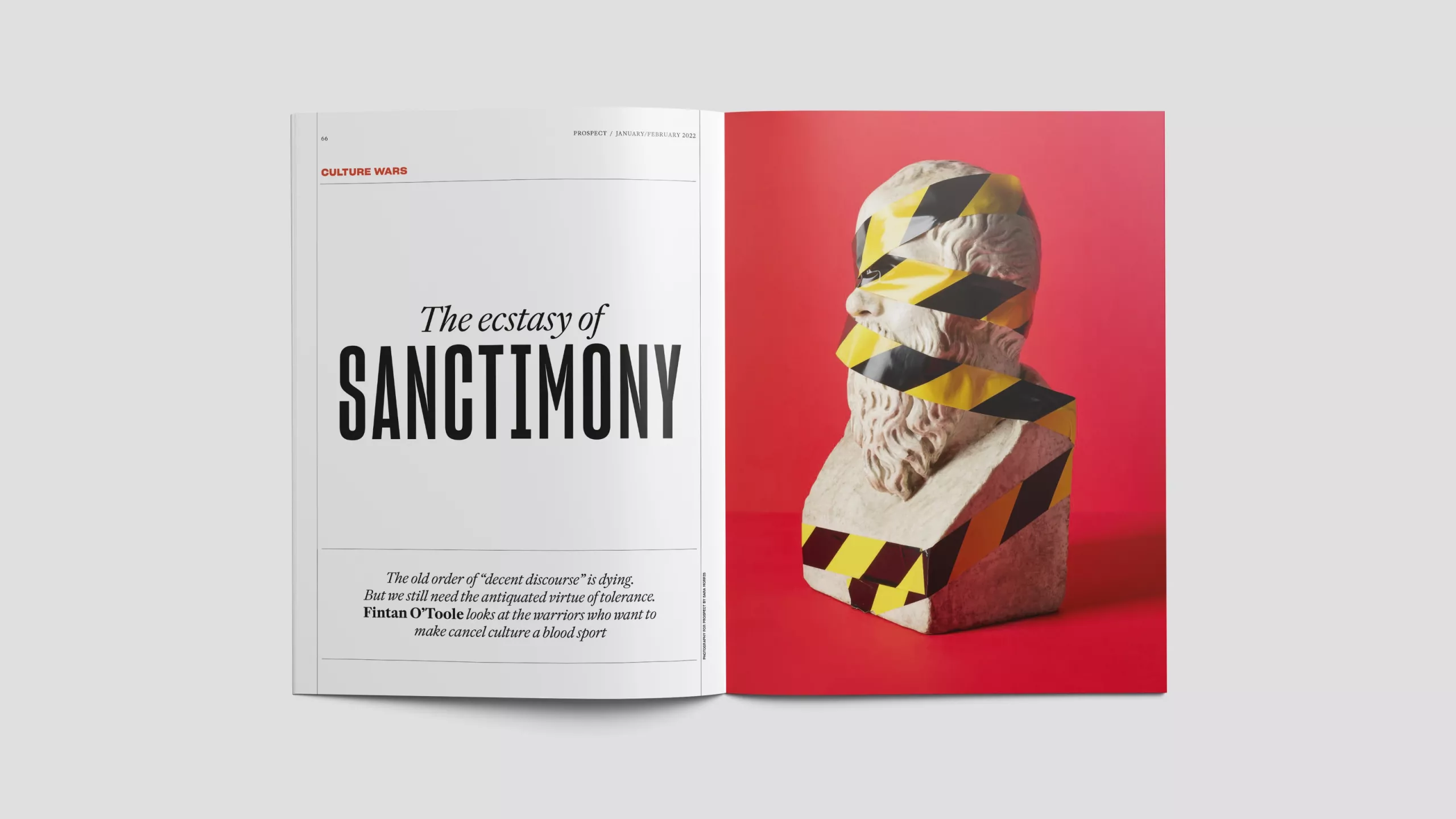
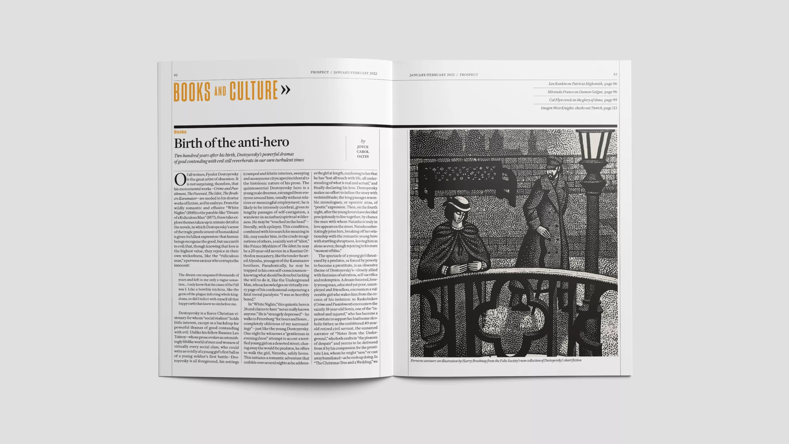
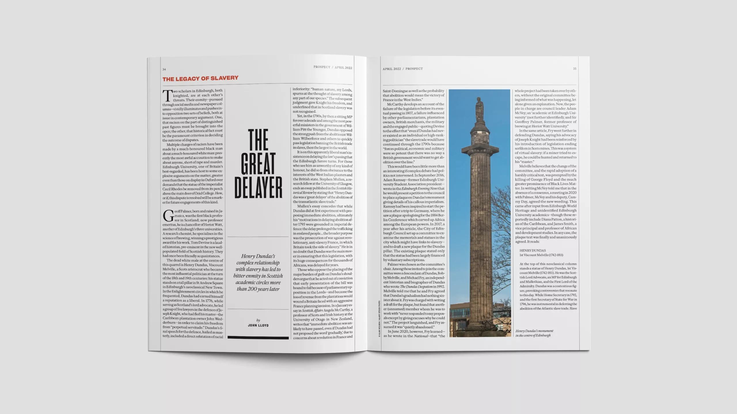
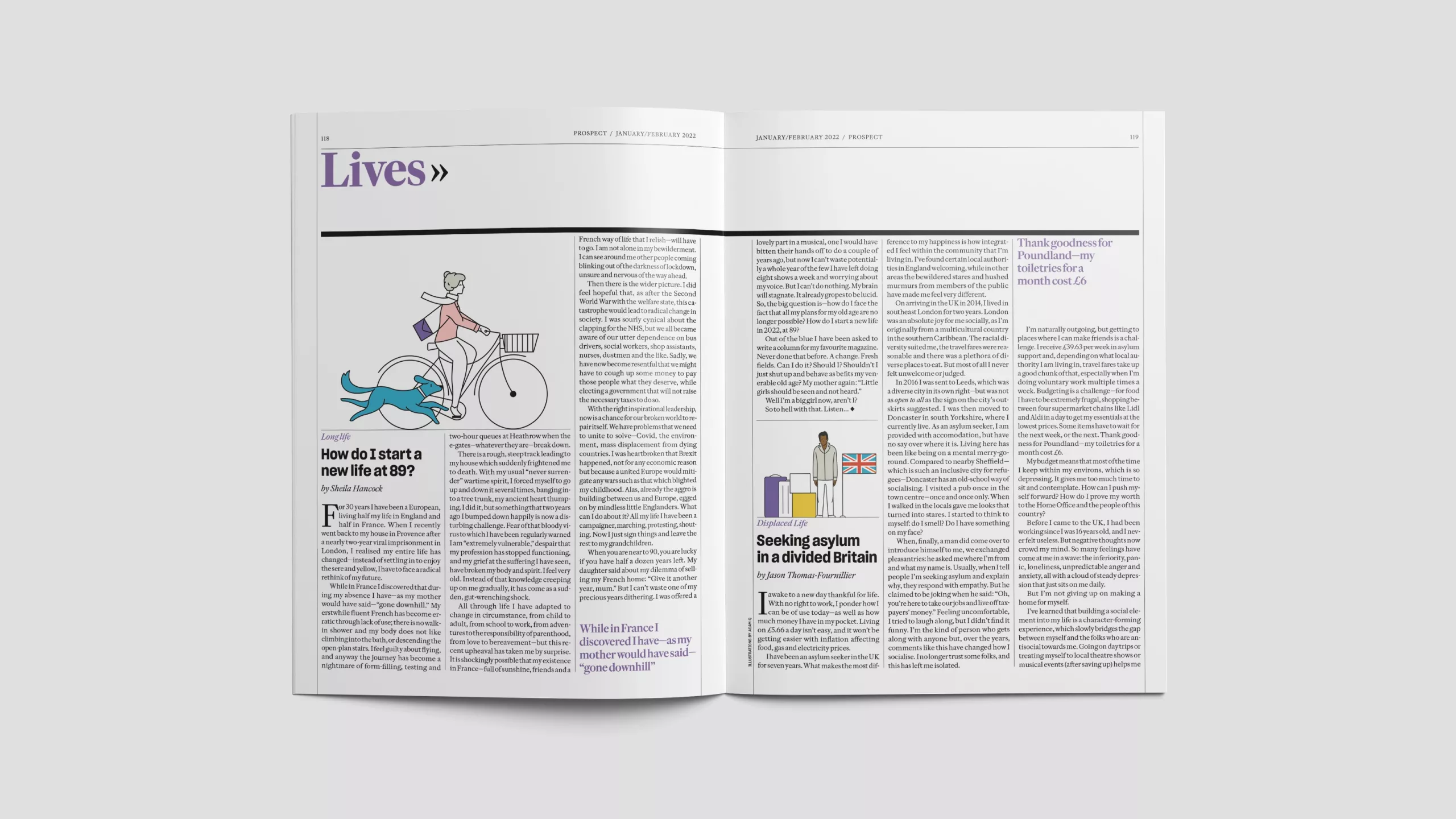
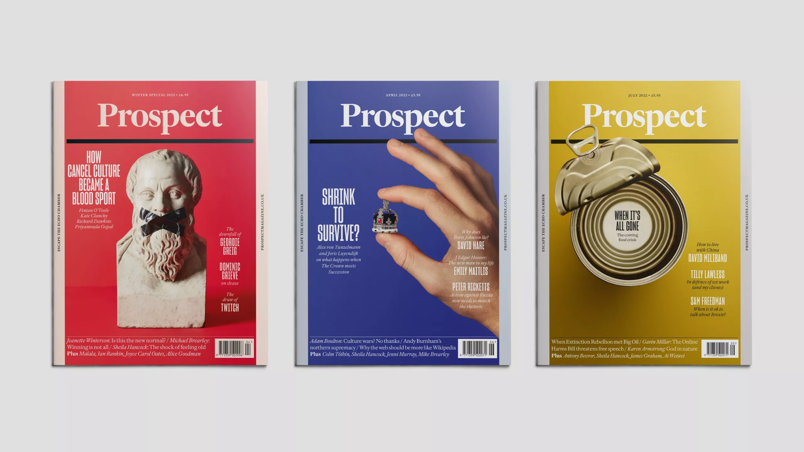
The system we delivered is elegant and restrained, but always inviting and accessible. It celebrates text and avoids unnecessary drama while still allowing for the dynamics and projection that a monthly magazine needs.
Perhaps the best expression of the new visual philosophy is the cover. Prospect’s subject matter is also covered by several high-profile weeklies which all take a similar approach to covers, based on fast turnaround illustration, photomontage and CGI. In contrast, we committed to creating Prospect's covers with practical still-life photography, which beautifully reflects the “slow journalism” inside.
We are proud to have given Prospect a new visual language which thoroughly respects its editorial mission and values.
Collaboration: Studio Brannan
In-house art director: Mike Turner
